Gothic Revival
Interior Styling | Hampstead

Makeover for a Neogothic Gem
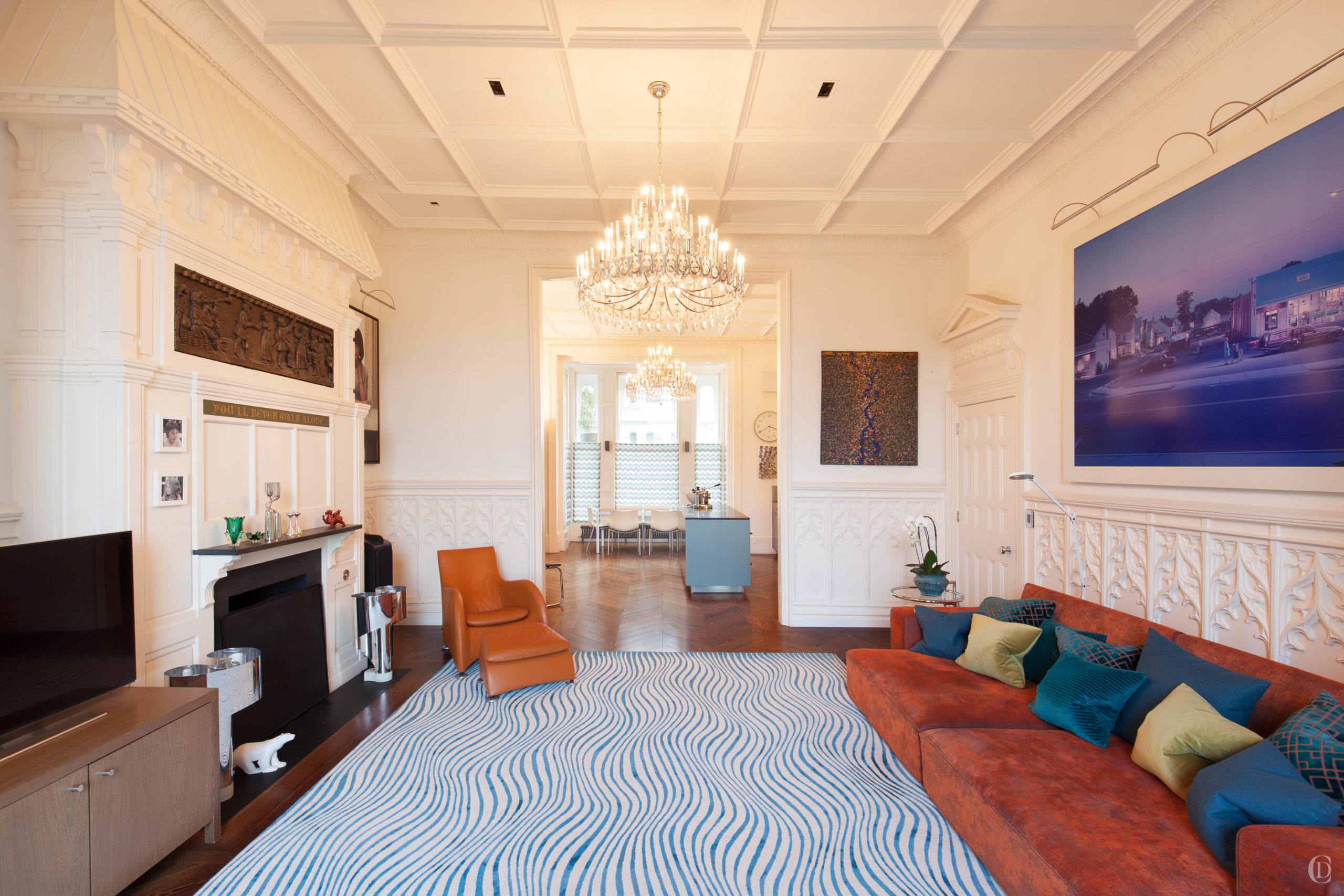
This apartment occupies the ground and lower ground floor of an imposing stucco fronted house in Hampstead and had been fully renovated a decade ago. Now the home had evolved with artworks and life changing, growing children and the client instructed us to give the apartment a full face lift and a new vibe.
INTERIOR STYLING
The mini -max principle
The briefing which we worked out with the client was to achieve a refreshed look of the entire apartment without works that would make a huge mess, require moving or storing furniture, taping up the entire place or even moving out. Maximum result with minimum hassle – that was the goal. We agreed to replace all soft furnishings and wallpapers, introduce a small amount of new items such as new lighting in a few crucial places and new furniture for the bedrooms.
Starting with a painterly palette
Refreshing an existing space without an entire overhaul requires us to absorb and develop a feeling for the place. To soak in the atmosphere, the architecture, the characters and understand the inspirations that will make people happy in a place.
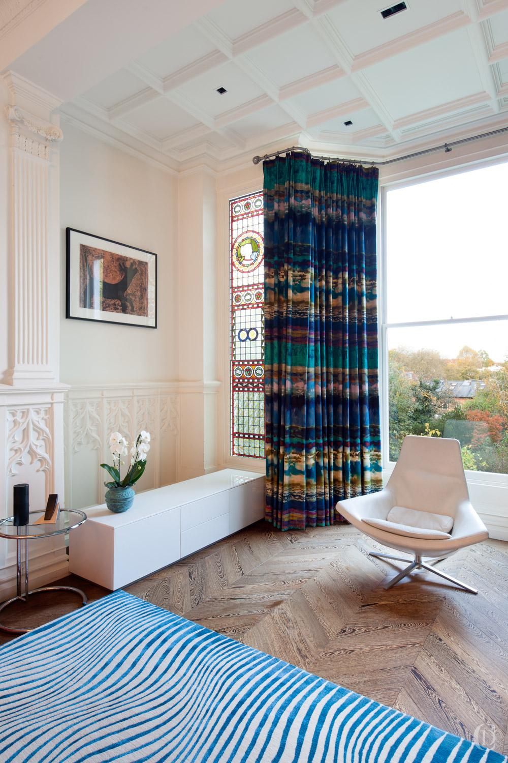
We start by picking a new colour palette and linking this to the existing pieces of art and furniture. The key influences for my selection of colours were: the cognac colour of the Vitra leather armchair, the blue, red, yellow and green of the original stained glass window and the aqua blue swimming pool in a photograph of the Hampstead Lido.
We agreed with the client that shades blue from acqua through turquoise to ‘canard’ will be the red thread weaving through the scheme and he specifically asked us to source fabrics with vibrant colours in organic, modern, abstract patterns or textures.
A marriage of Styles
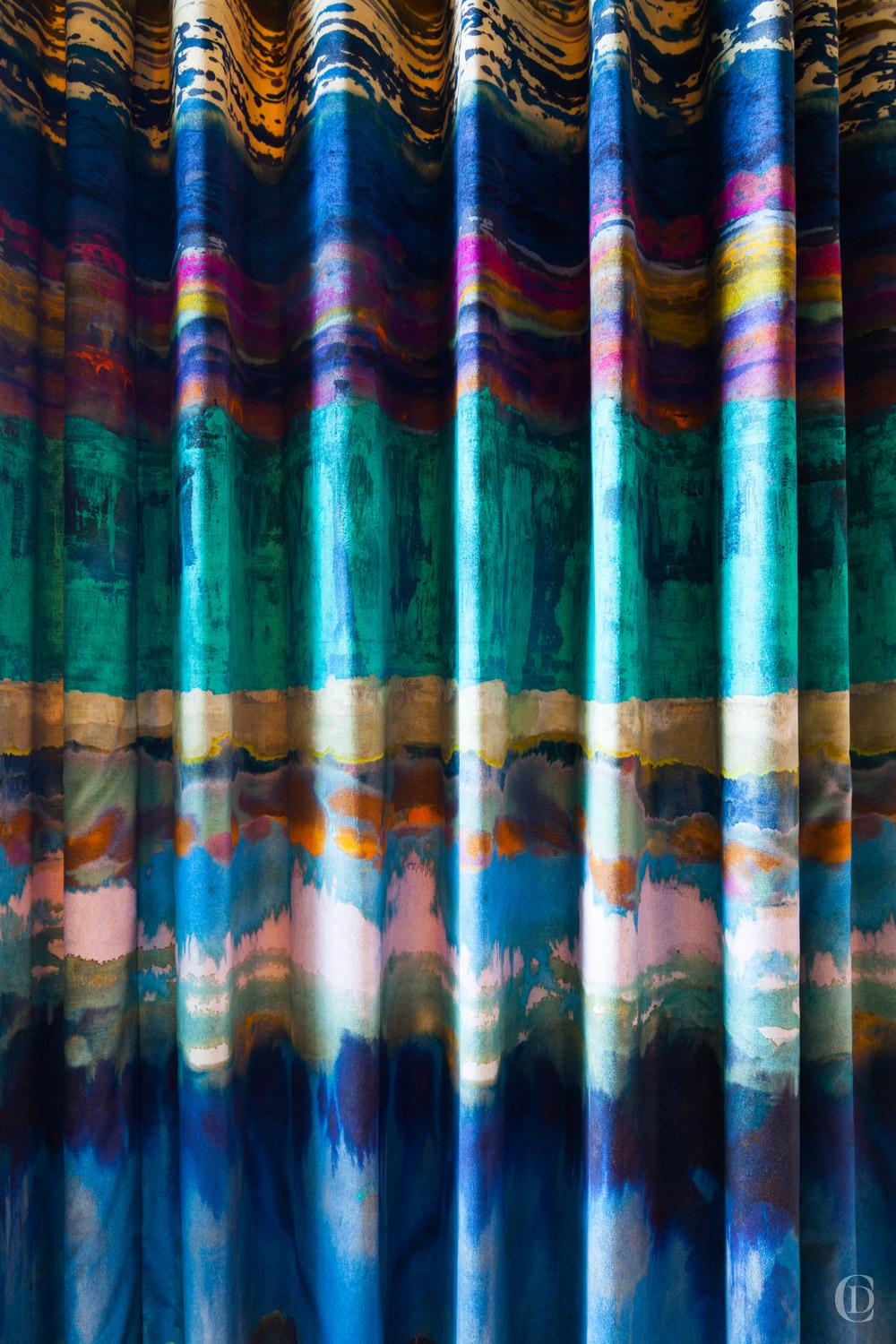
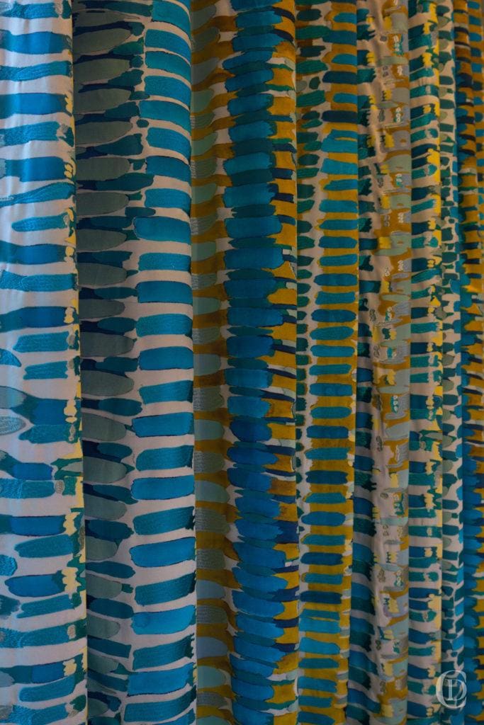
The architectural features on the ground floor which comprises of the main reception room at the rear connected with an open plan kitchen dining and front bay window, as well as a study, are stunning. The Gothic revival wall panelling, ceiling cornicing, door architraves, manor sized fireplace overmantle and stained glass window offer a grand backdrop for the collection of contemporary photography and paintings and the minimalist Bulthaup units which look like furniture and not like a kitchen at all. After agreeing the colour scheme for the living room, we sourced probably a hundred fabric samples before settling on this incredible curtain fabric. The design is based on a unique fine art painting by a British artist and then printed on velvet. We truly persevered for a long time before this fabric crossed our path and it felt like a match made in heaven; the fluidity and modernity of the in contrast with the minute accuracy of the stained glass hangs like a work of art.
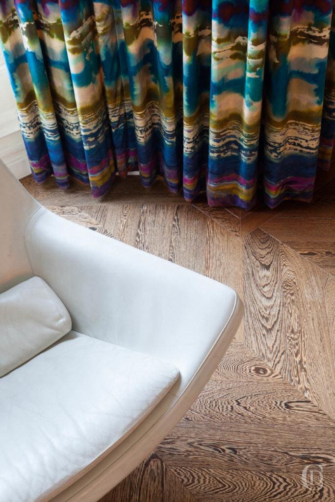
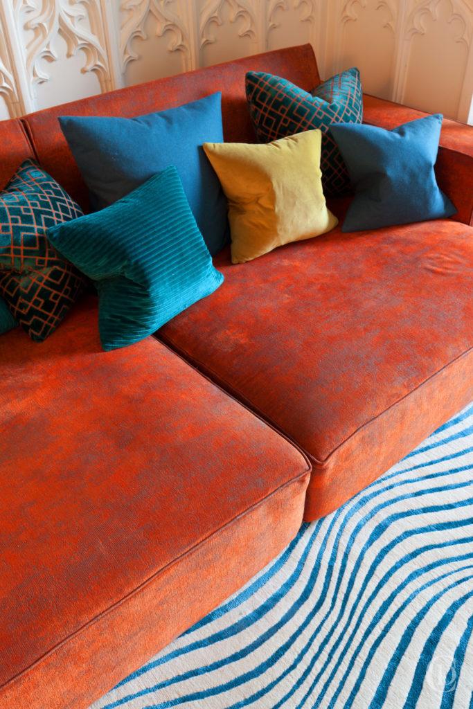
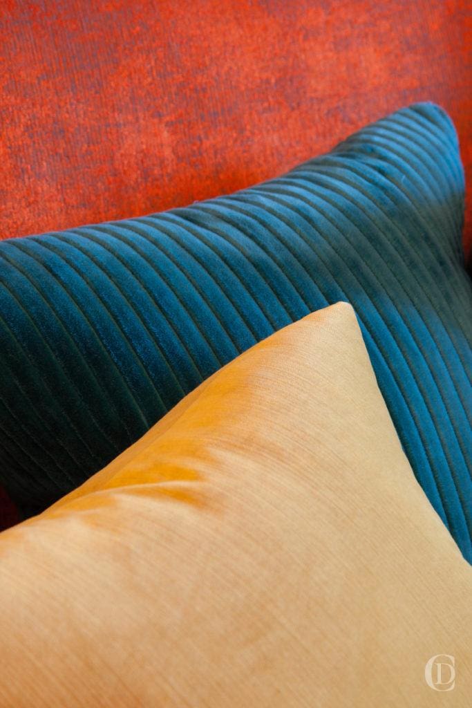
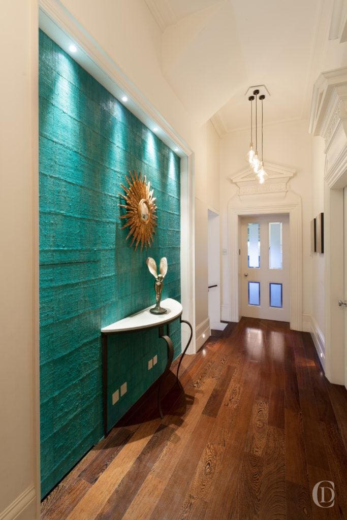
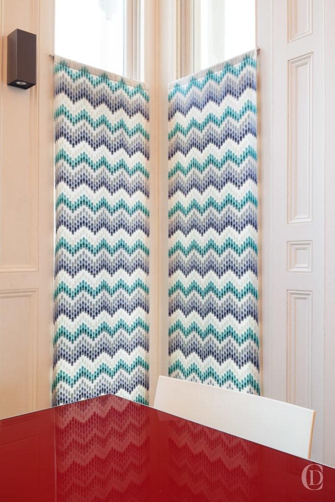
From there on everything started to fall into place. The living room acted as the guiding thread throughout the ensuing design journey. We settled on a rusty cognac coloured velour to recover the BB Italia sofa and composed a vibrant collection of cushions. We sourced several pieces of iconic furniture and lighting to complement the space. The shades on the embroidery of the sheers which hang in the kitchen bay window connect with the rear curtains. The entrance feature wall was recovered with a coarse handmade seagrass paper. The rough and informal texture of the wall contrasts with the formal and hard surfaces of the stone console, the French mirror and bronze sculpture.
What lies beneath
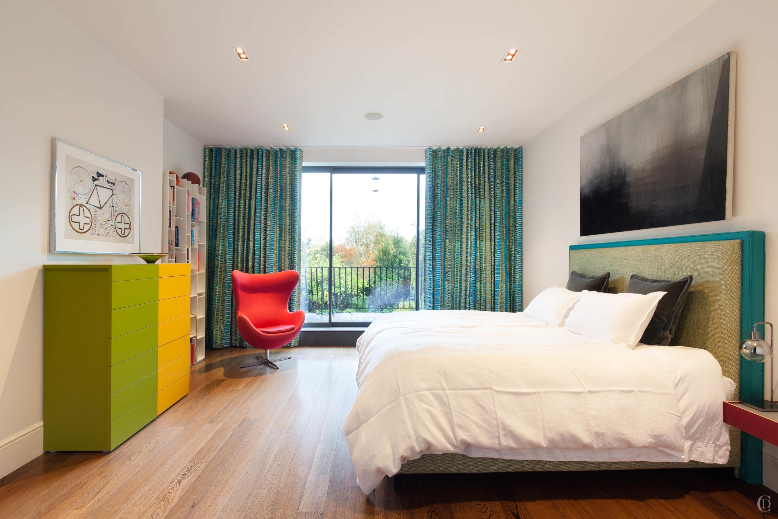
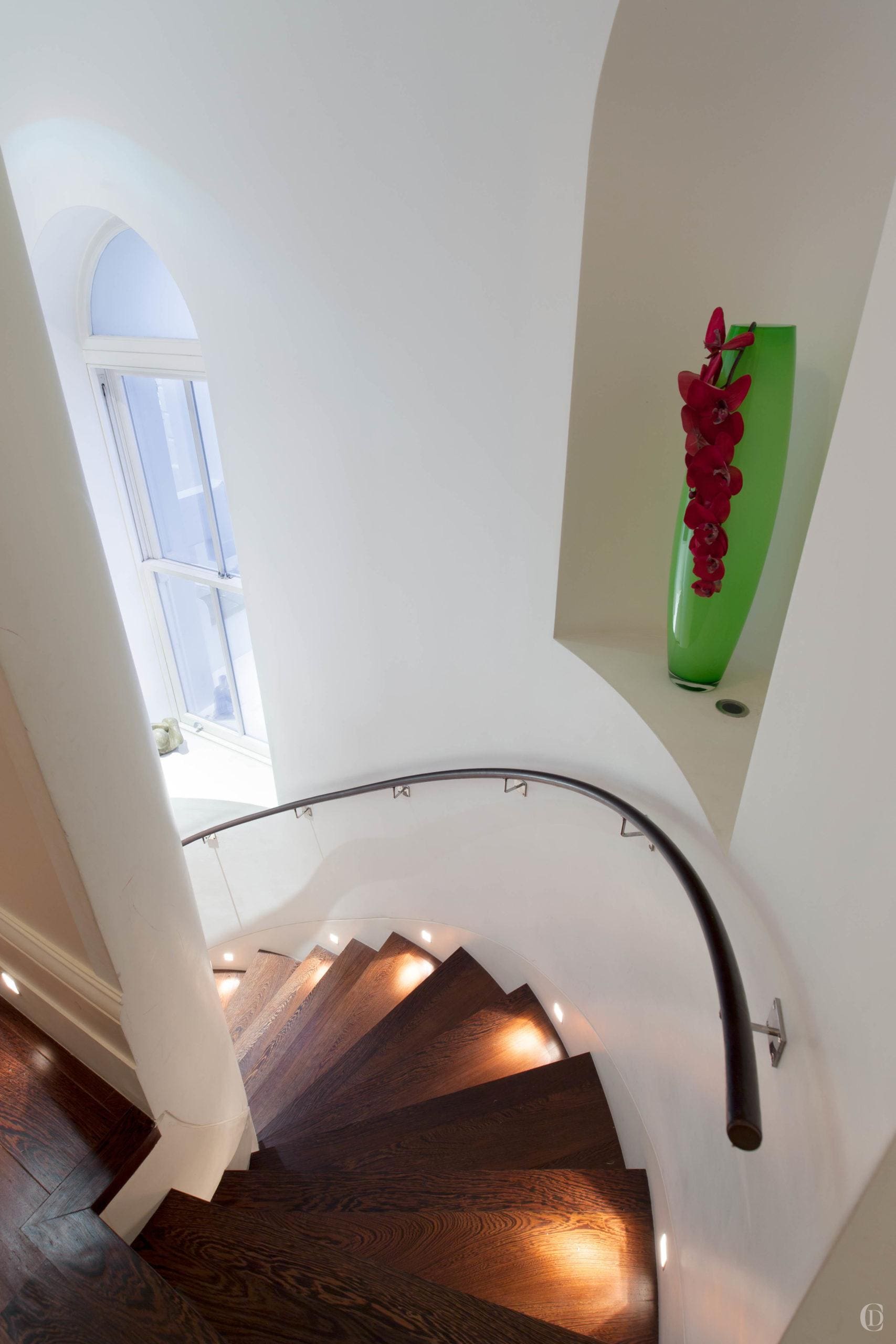
A curved modern staircase leads to the bedrooms on the lower ground. They have generous proportions, high ceilings and their achitectural design is contemporary – no cornicing, plain skirtings, dark brown solid floors and matching simple recessed architraves and solid wood doors and modern windows. We refreshed all soft furnishings in the bedrooms, picking fabrics to tie in with the tone set on the reception floor. The master bedroom curtains used to be an eyelet design on a pole and sweep the floor like a ballgown. We replaced this with a smart wave headed flush fitting track. This offers both a more contemporary finish and a better blackout result. The fabric we found for the bedroom was another needle in the haystack. We wanted a design which is modern, abstract, organic and tied in with the shades of blues and absinthe green and yellow of the drawer units. If we had designed a fabric to match our requirements, we could not have asked for a better match.
Functionality and comfort
Getting a great night’s sleep is a luxury we deserve. After a decade it is well worth replacing a bedbase and mattress.
We often work with French brand Treca who have been making had made beds for over 80 years. Every base and mattress is made to order and we can tailor the comfort and the look for any requirement.
One of the most popular bases we recommend is their pop up storage bed which is completely unique on the market; it has a patented sandwich system of sprung slats in the base. This allows for a full size storage base without compromising sleep quality. You get all the comfort of a divan base with all the space of a wardrobe underneath.
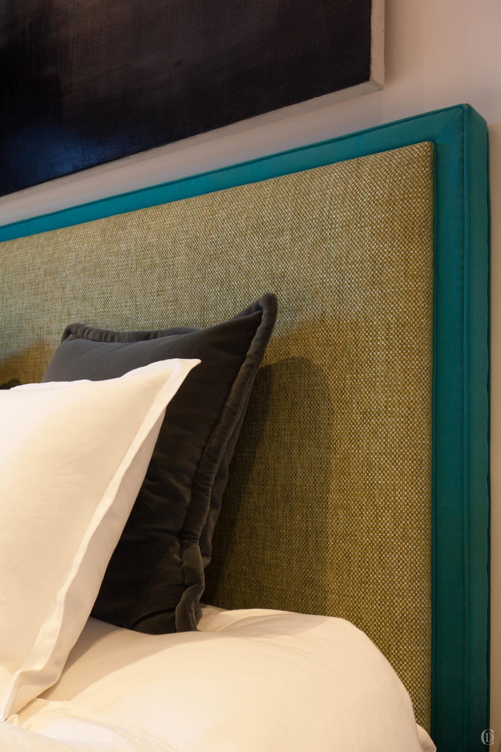
Then we design a bespoke headboard in a style to suit the space, with fabrics to match the scheme and ….voilá.
All the little details
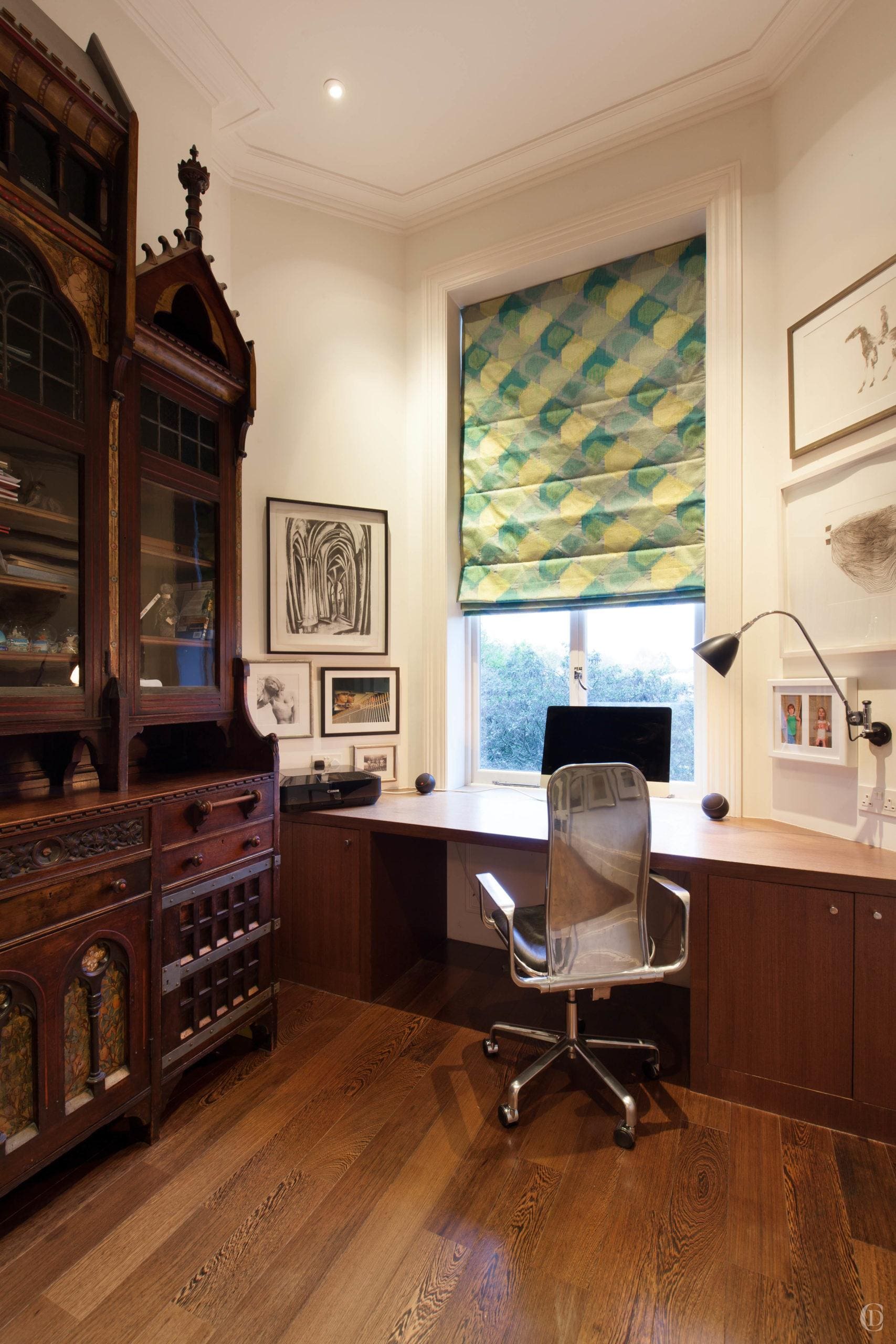
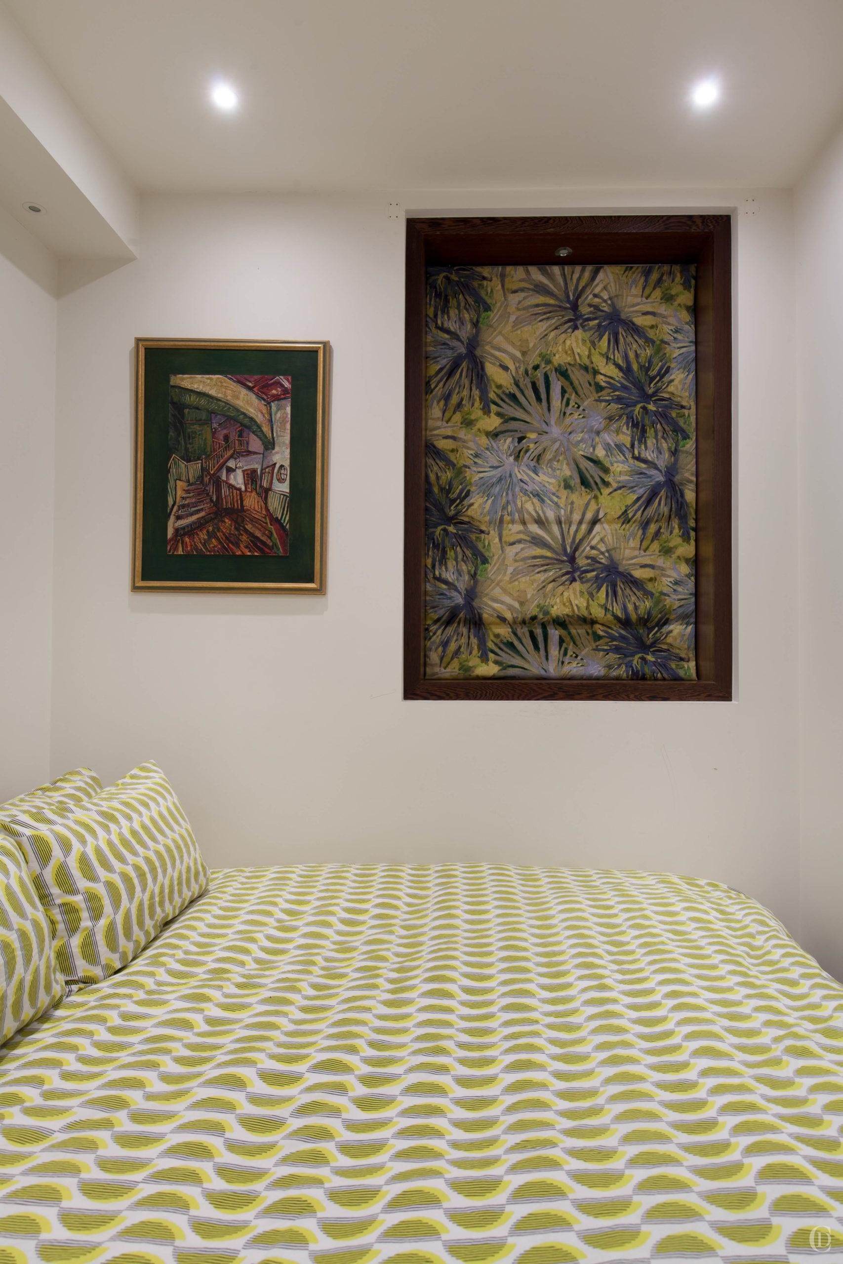
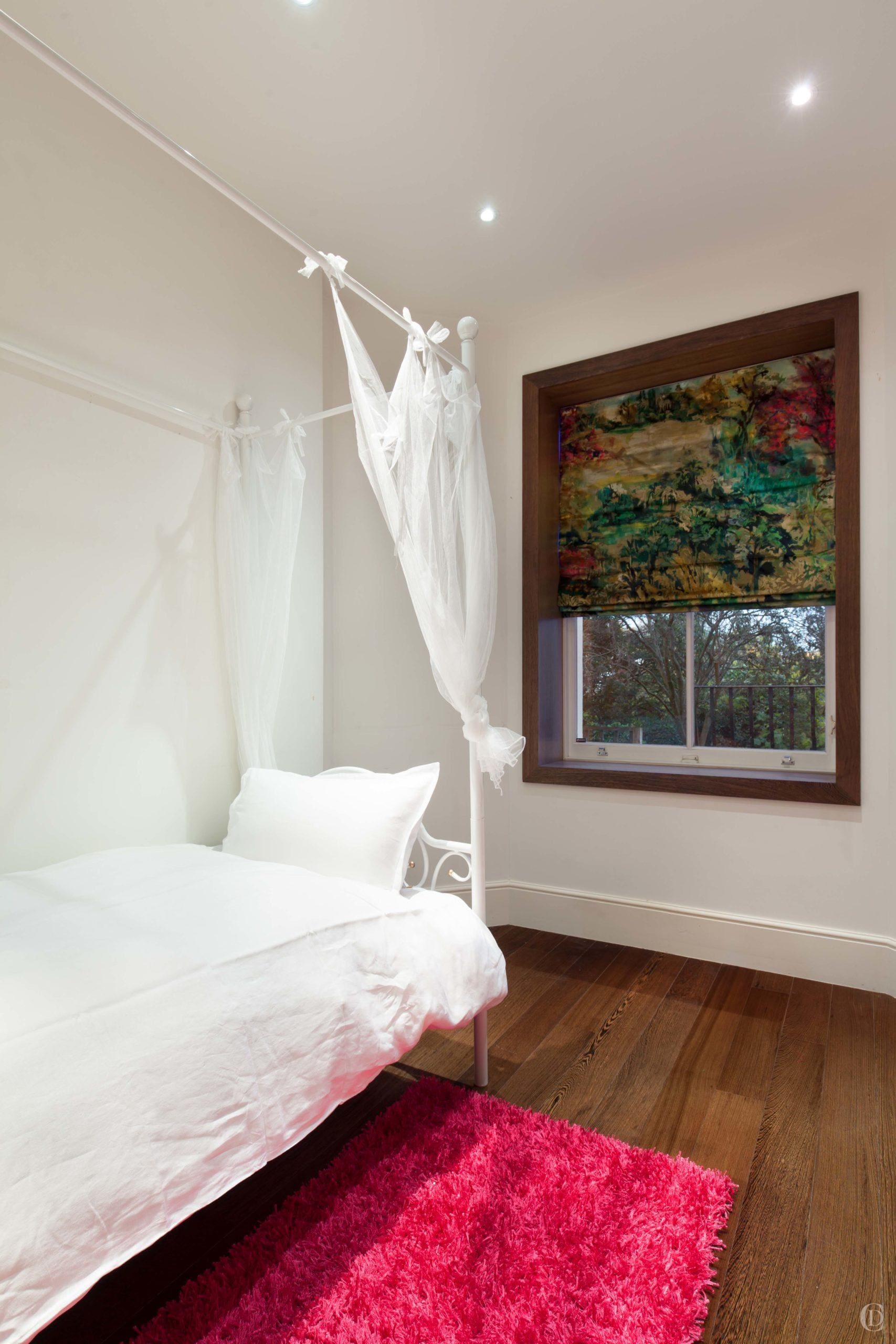
The remainder of the scheme carefully picked to link all the spaces together. The colours are a harmonious continuation, without being repetitive as there is enough variation wihtout the palette. The study has a new Roman blind in an embroidered fabric of yellow and green acqua hues, a guest room continues with absinthe to blue and cream. A Roman blind in the girl’s bedroom picks up every shade from yellow, greens, turqoise and pink.
The Long Wait
Commissioning a bespoke rug is the icing on the cake and will really help pull a scheme together. It is hand made for a particular room, of a quality that will last for many decades and there are many factors to consider.
To start with we proposed a range of suppliers of hand knotted rug designs. Instead of creating an entirely new design from scratch, we found a motif which really captured the spirit of the space – the ripples in this design are modern, organic and timeless and they hint at the water of the Lido which is our clients’ inspiration.
We worked closely with the manufacturer to pick the exact shades of cream and turquoise to harmonise with the curtain, the artworks, cushions and leather chair – if you are ordering a custom made rug you can pick from hundreds of colour poms. You can also completely customise the size and the exact composition. In this case we initially commissioned two samples in different qualities and then agreed on a composition where the white is wool and the blue ripples are silk.
The last thing to consider is that a bespoke hand knotted rug will take around 16 weeks to deliver. Due to the design process involved which requires the colour scheme and fabric selections to be completed before finalising the rug order, it does mean this will probably be the last thing to be installed…..it is the icing.
