Georgian Beauty Revived
Interior Architecture | Blackheath
INTERIOR ARCHITECTURE
Defining the Brief
From imagination to reality
A professional couple lived in their beautiful Georgian house for a few years enjoying the spacious garden and surroundings of this historic neighbourhood. Both managing busy careers had not left them any time to imagine how the property could be improved and the major downfall was the first floor with two bedrooms and one huge bathroom which were outdated, poorly configured and did not meet their needs. We were appointed to reimagine the first floor.
Bringing a Dream to Life
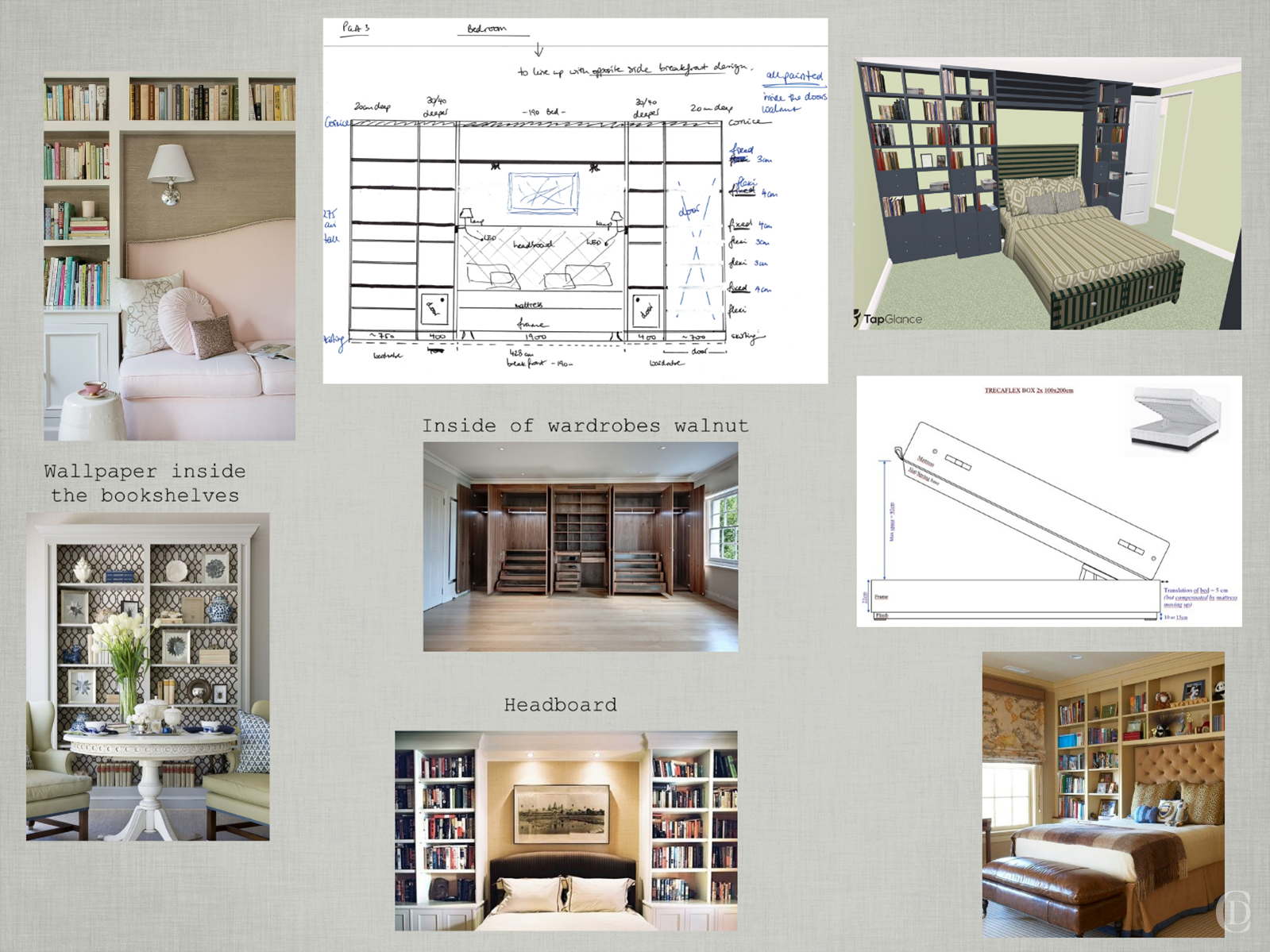
Imagining an entirely new arrangement for a floorplan is tricky. There were no accurate plans for the house so we first surveyed the spaces and then sketched over the existing plan and used 3D models to show the possibilities. Space in Georgian buildings is limited and floors and walls are crooked, and decades of poorly executed renovations left these rooms riddled with pipes and boxings which looked horrid. We worked through options and configurations to maximise and optimise the space for each area. Floors and walls were gutted back to the beams and bricks and then rebuilt and newly decorated. The spaces were entirely rewired and replumbed.
A New Passage
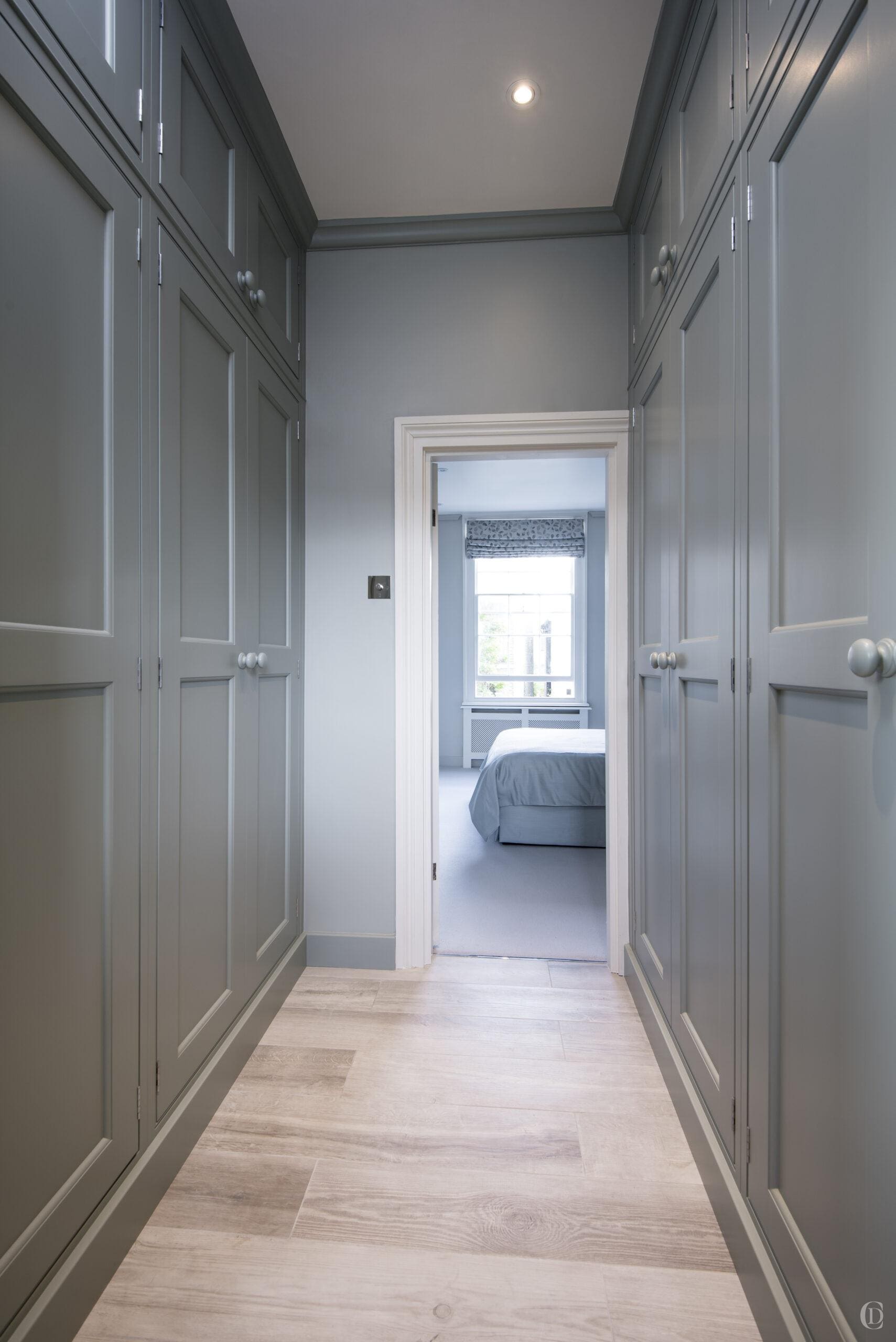
We moved walls and doors to create new rooms which will meet the lifestyle requirements. The dead space with no windows between the front bedroom and rear bathroom is now used as a walk-through dressing room. And part of the landing space has been reconfigured to create a new washroom for the second bedroom on this floor.
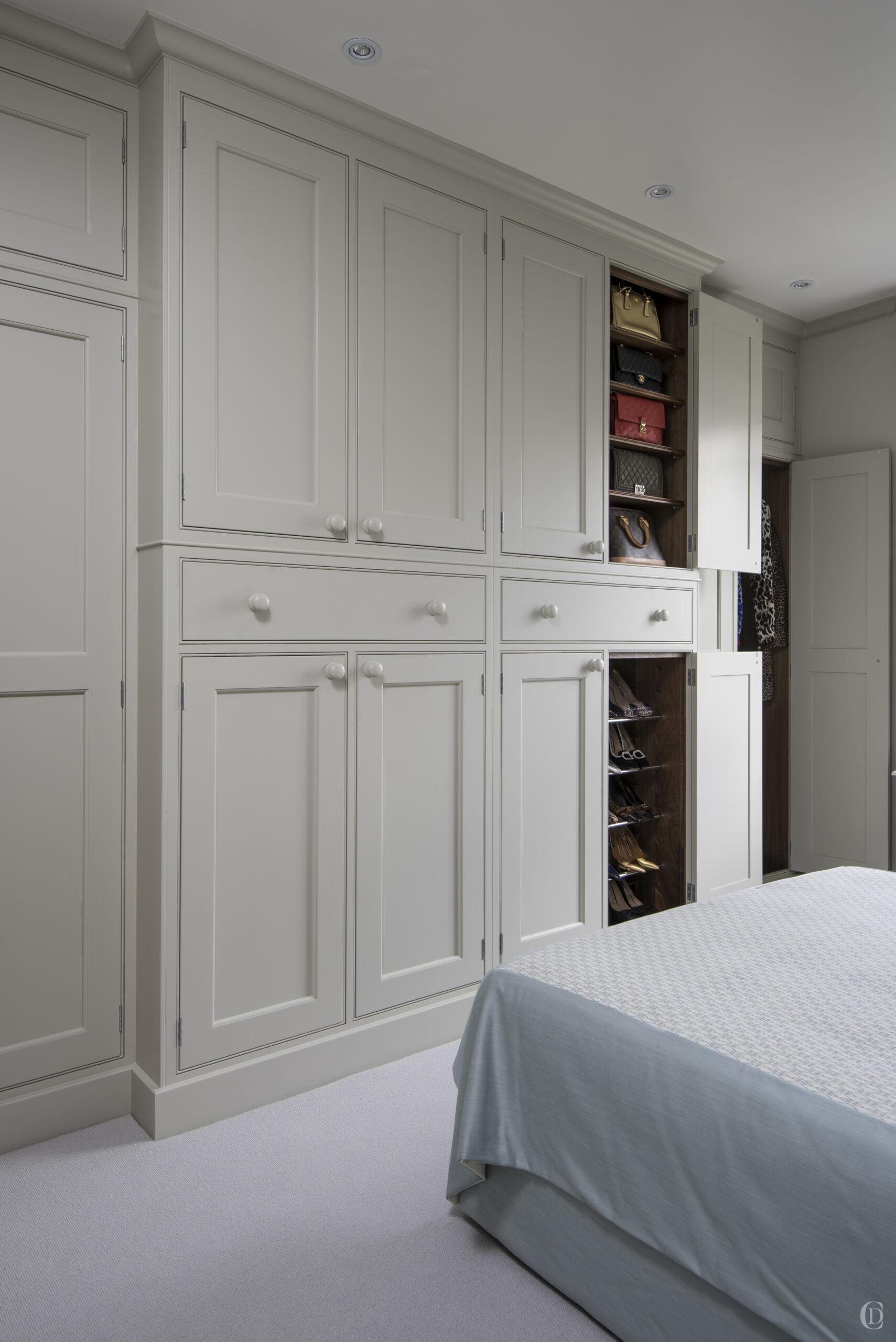
We designed joinery to look streamlined and smart, every inch of space is used, the straight run of cabinetry shaker joinery betrays the running of pipes and nooks behind which could not be moved.
INTERIOR DESIGN
Colour Consultation
Bedroom sanctuary
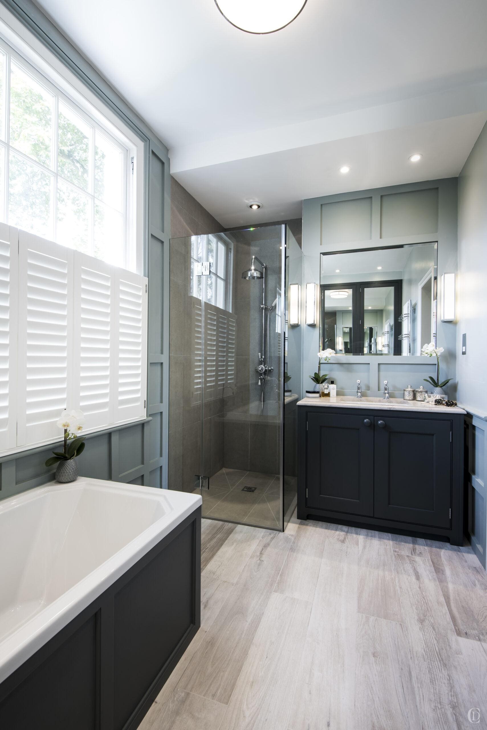
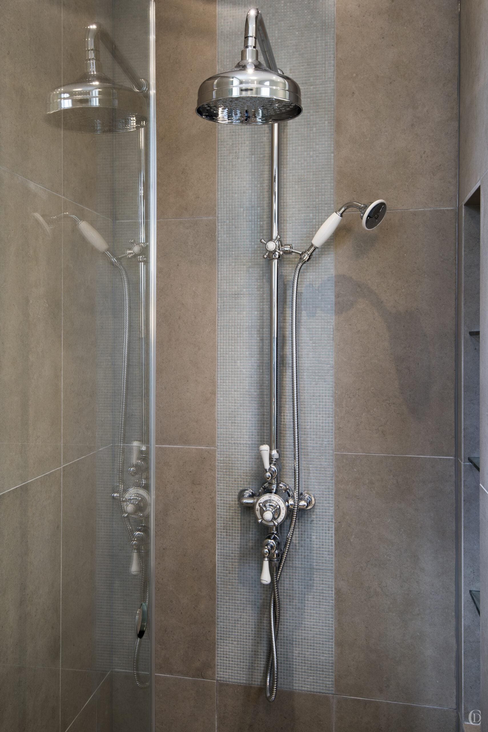
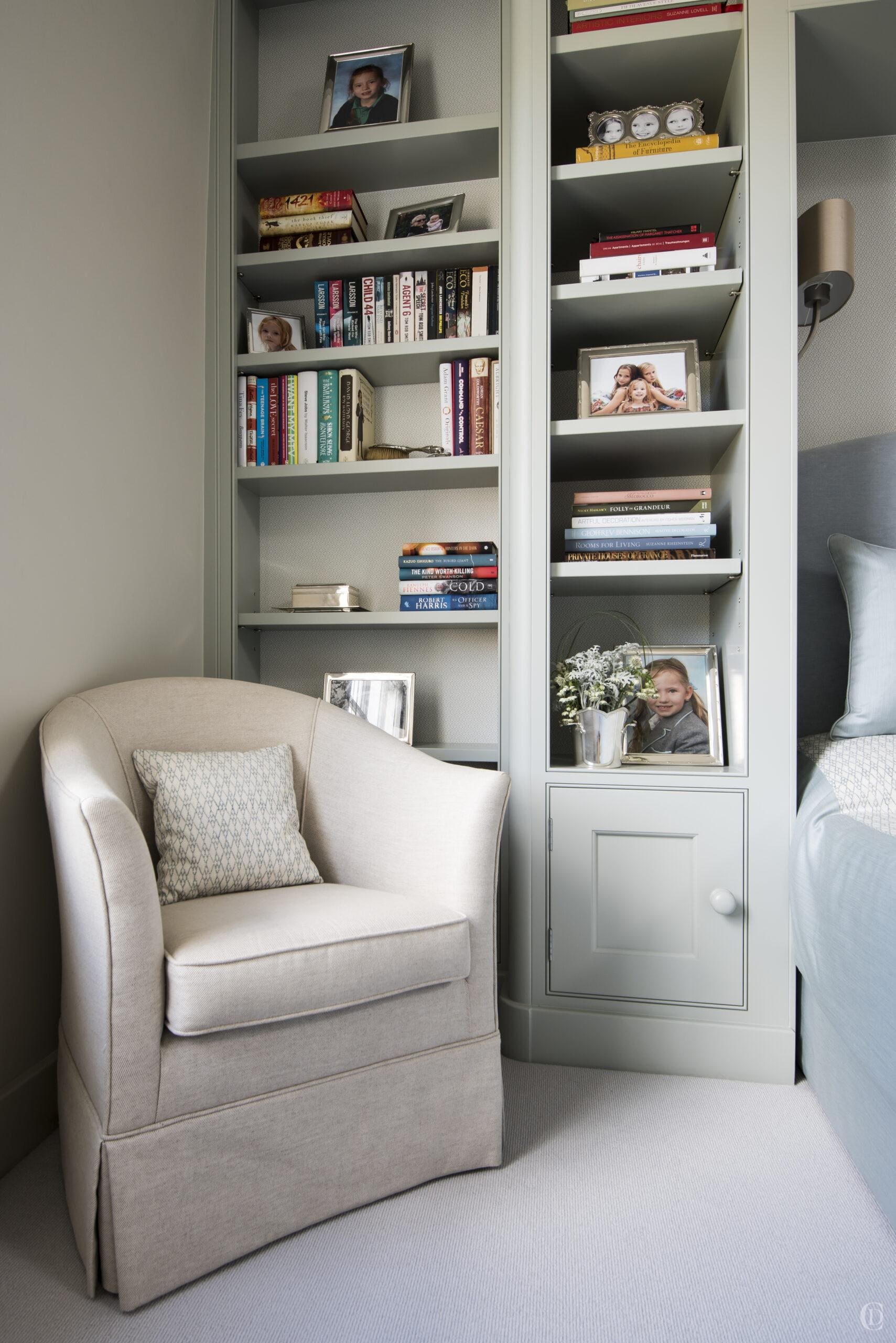
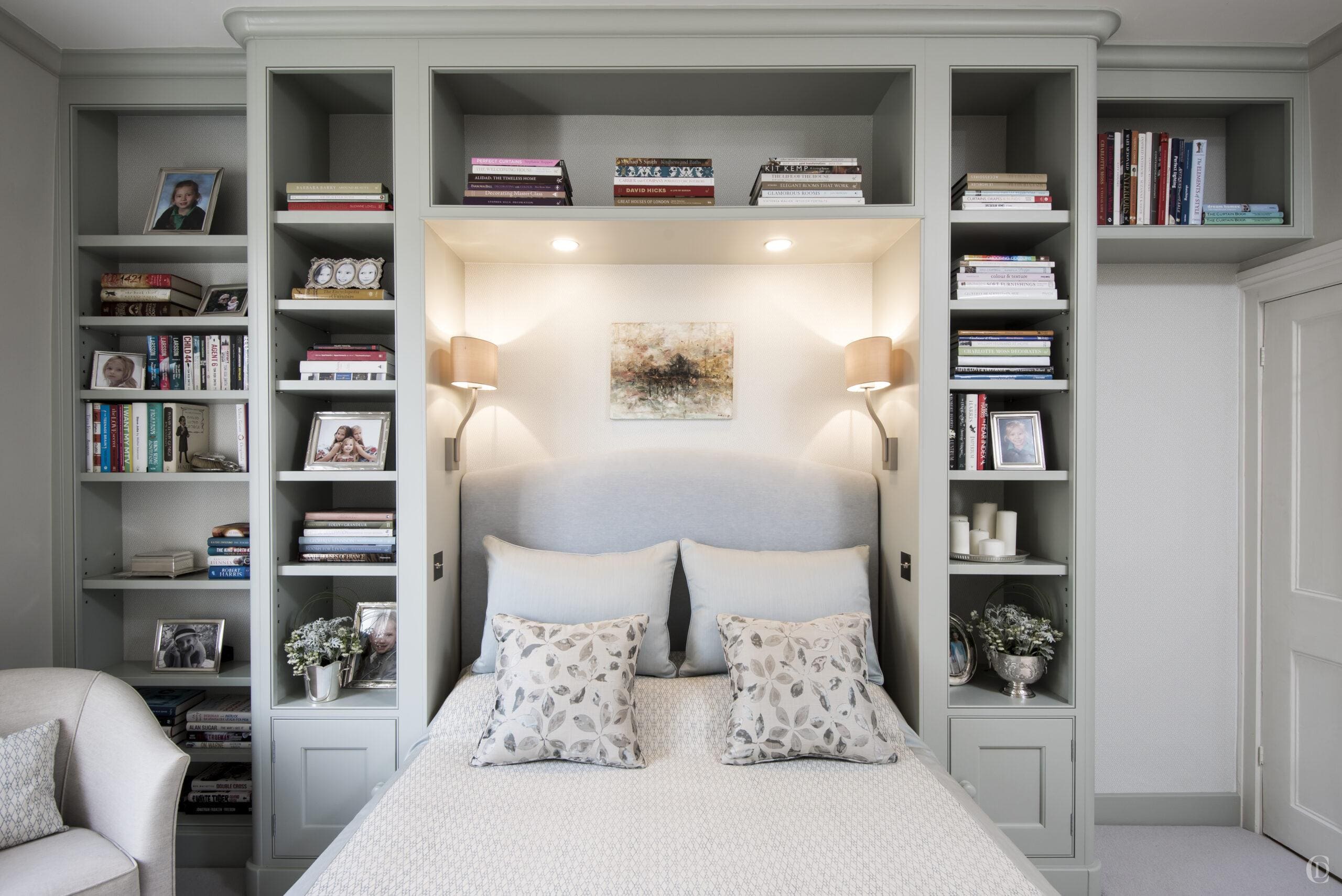
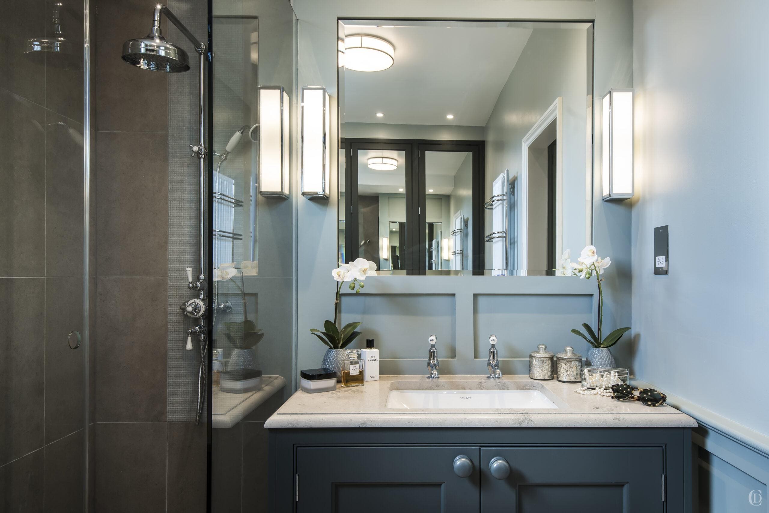
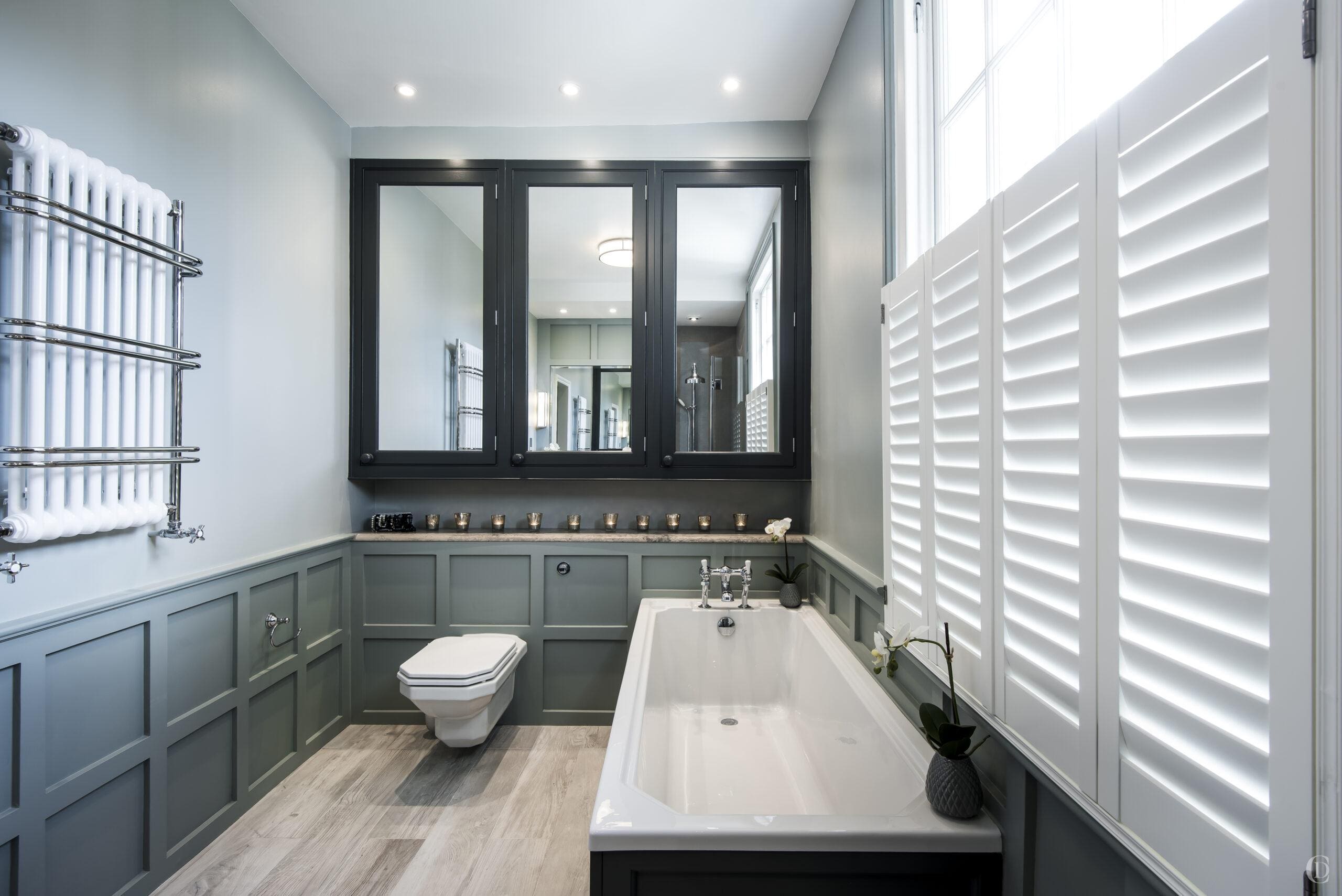
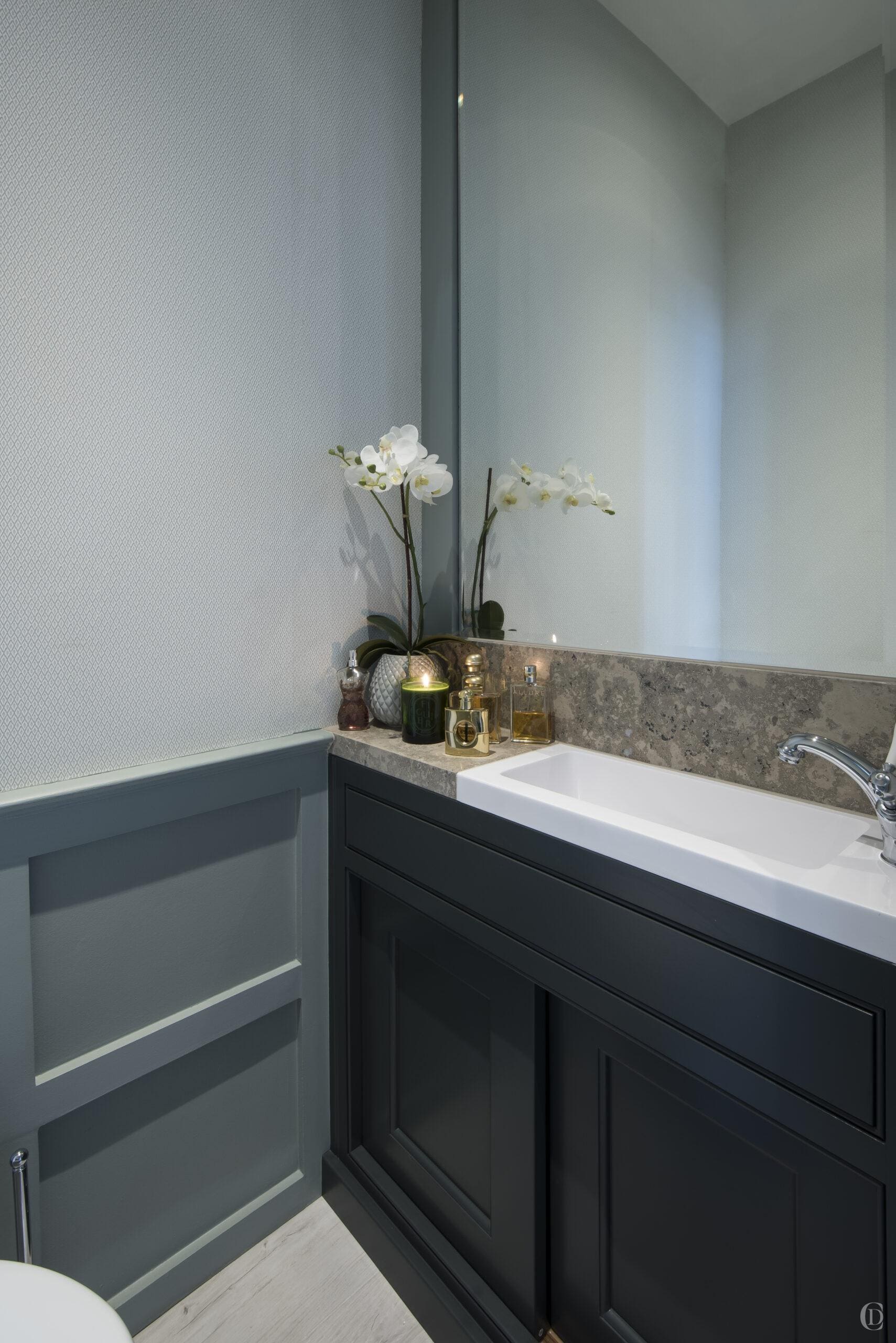
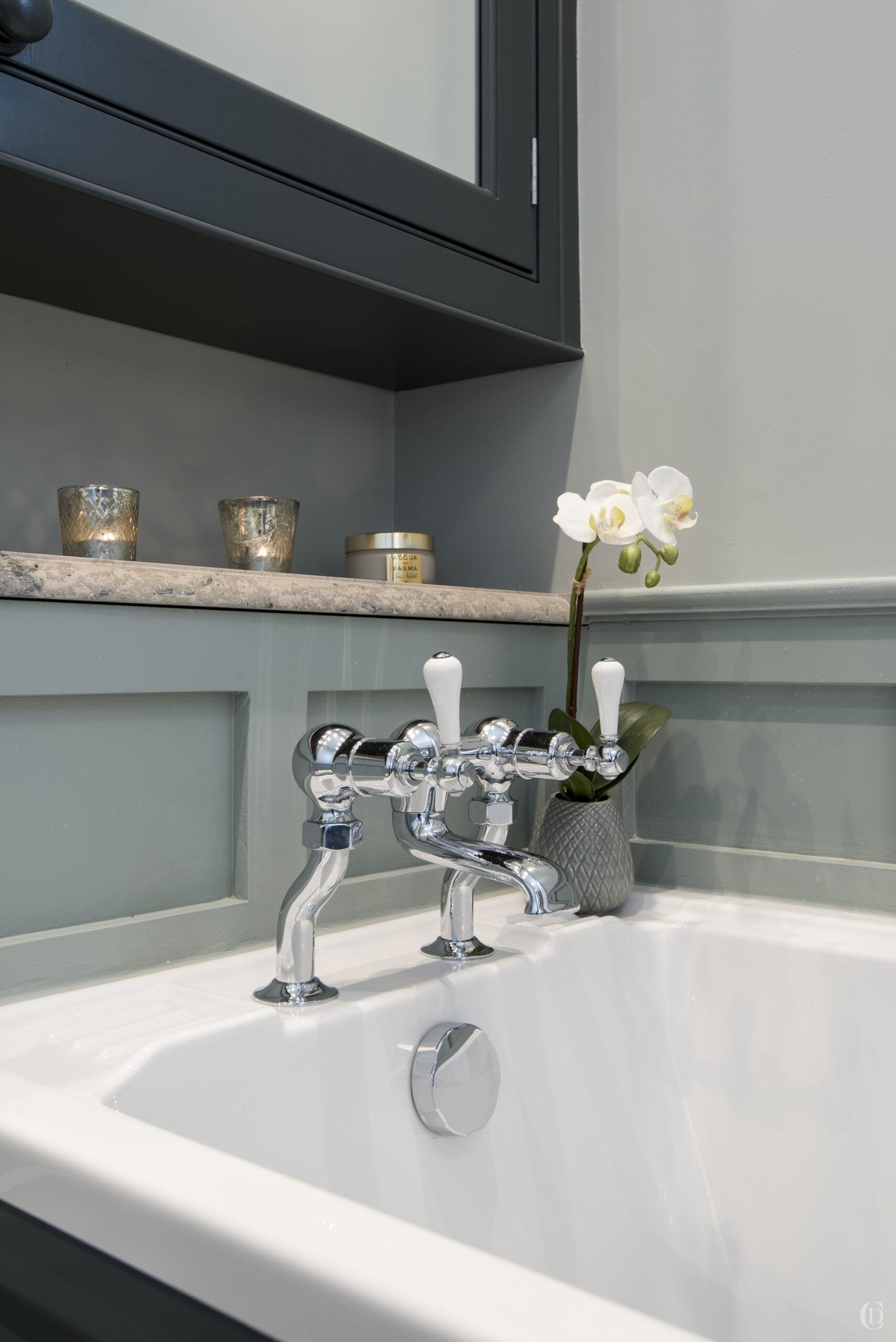
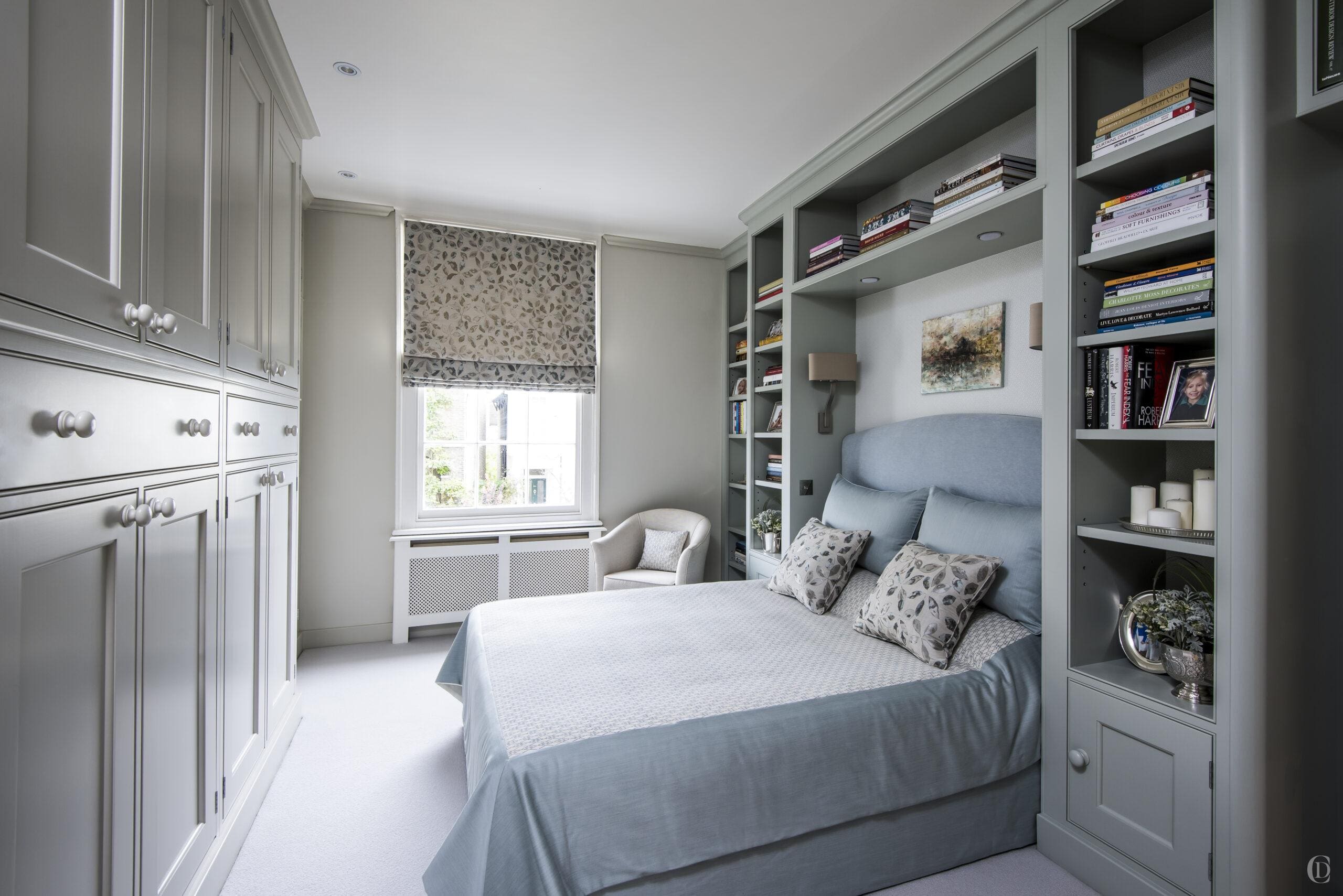
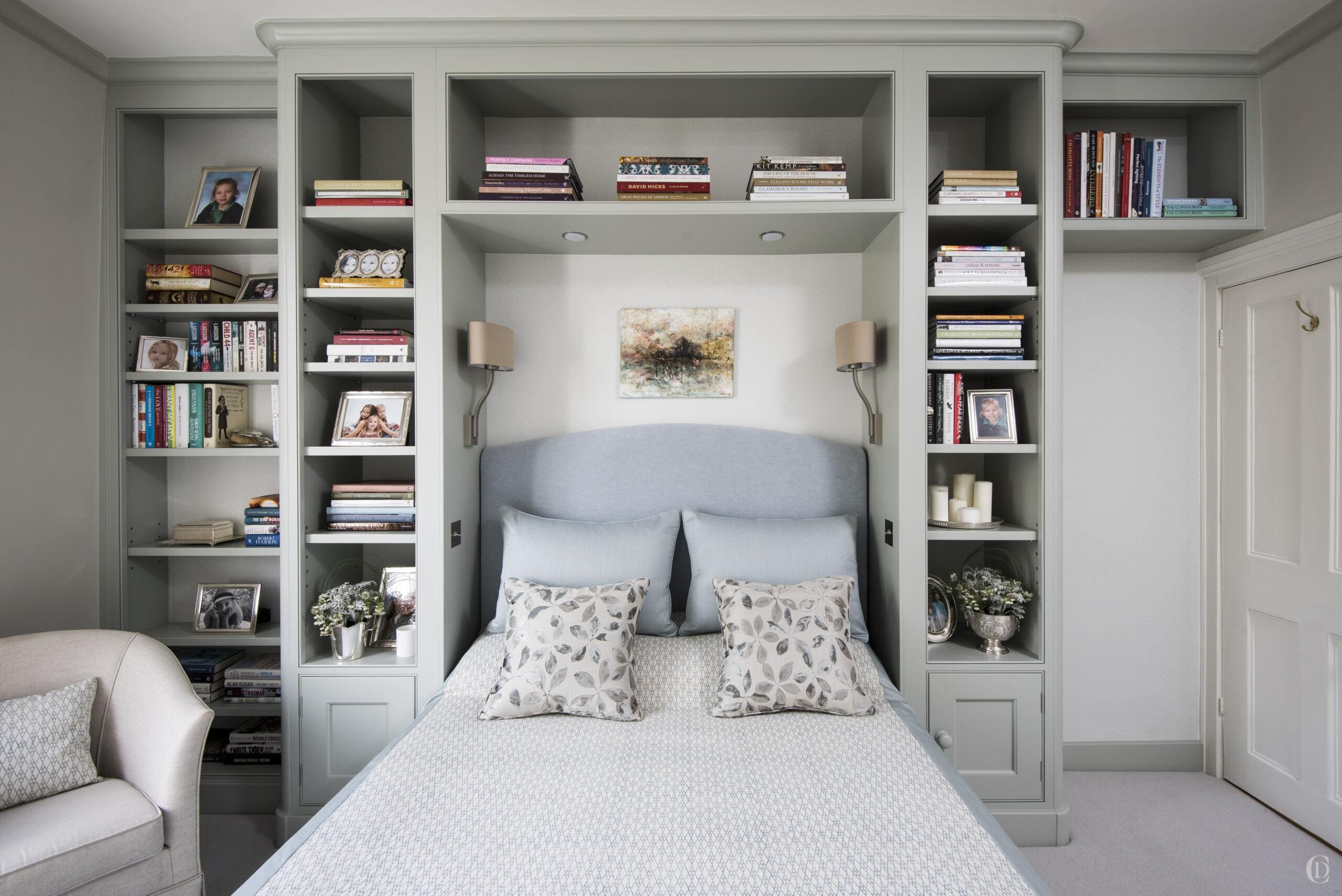
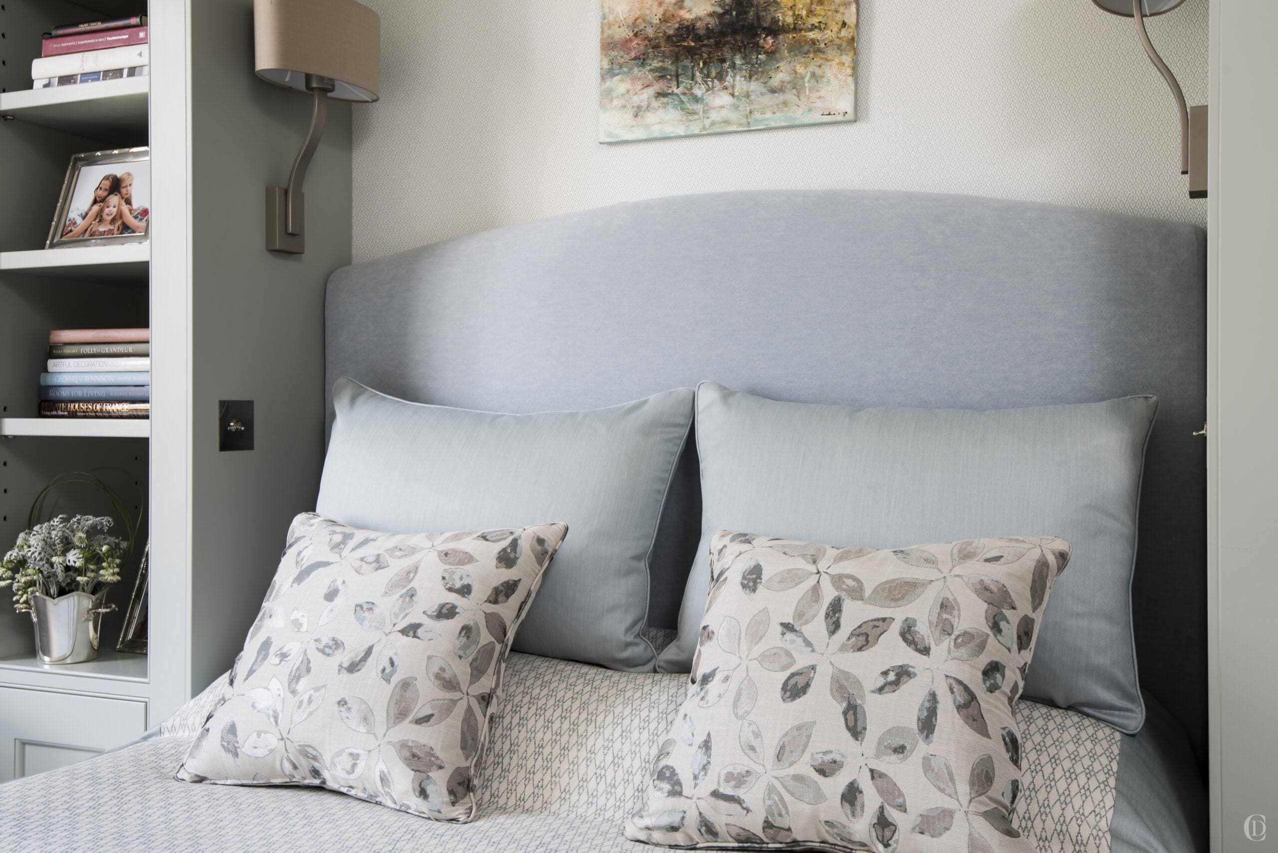
The clients asked for calm soothing colours to blend well with the rest of the Georgian property. We devised a scheme for all the spaces on this floor to transition smoothly. The style of furniture and all the fittings, sanitaryware, textures and fabrics exude a timeless and classic, informal elegance. We used a subtle palette of greys, greens and green blues on paint, wallpaper and fabrics which we applied to both bedrooms, dressing room and bathrooms. Besides the reconfigured floorplan the second major element was the bespoke joinery design. Installing large expanses of painted surfaces can make rooms ‘cold’. To balance the impact of the joinery and soften the spaces we introduced other materials ; a mixture of fabrics including wool, linen and mohair ; walnut veneered internals for all wardrobes; wool carpet; we lined the backs of the bookcases with wallpaper. The bathroom features wood effect tiles, a beautiful speckled limestone and a glass mosaic in the shower.
Bespoke Joinery
Let us make your dreams come true
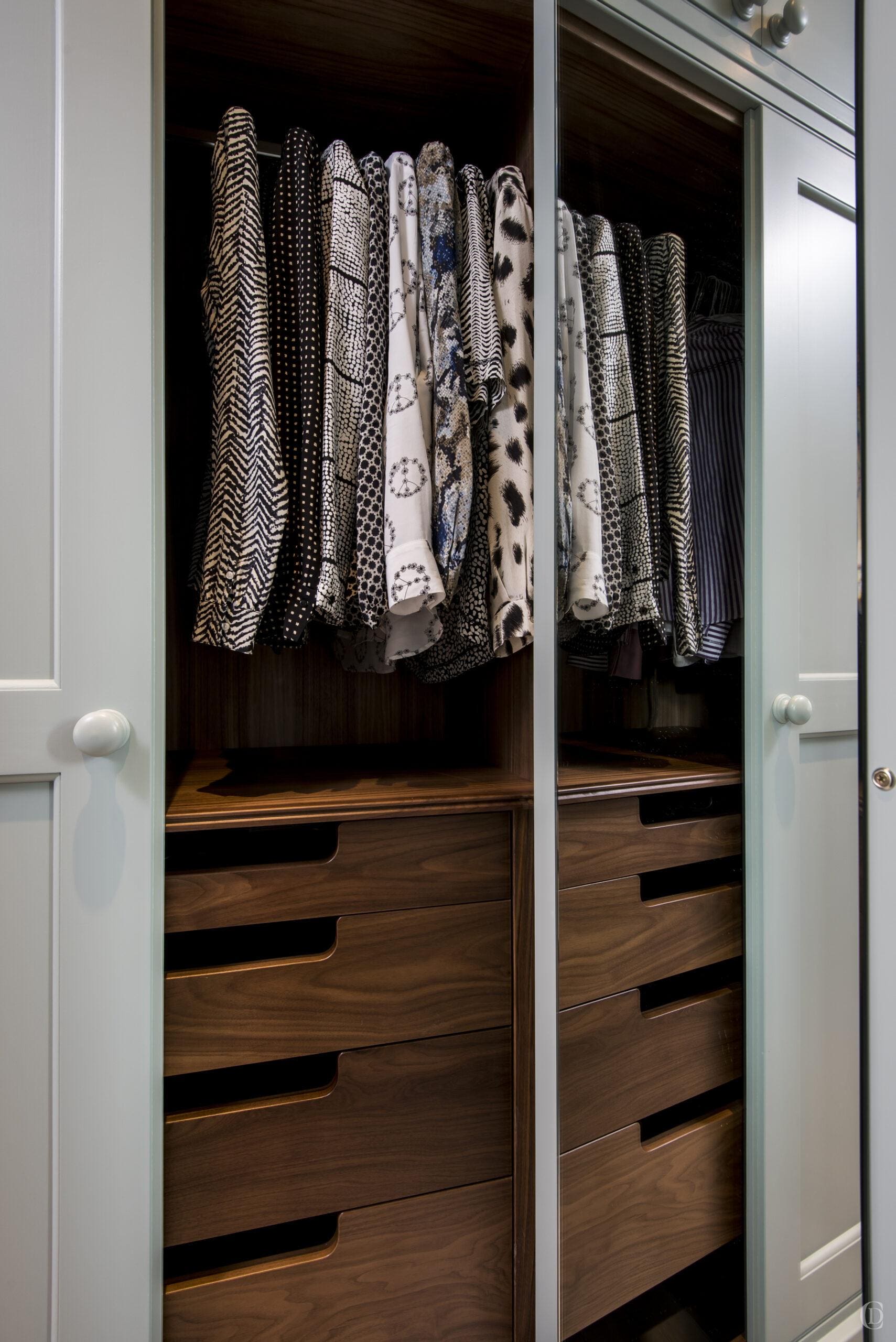
The master suite was desperately lacking in storage space. The floor plan envisaged the installation of a full suite of joinery in the bedroom on both main walls as well as walk through dressing room and additional storage in the bathroom. Designing bespoke joinery is our passion and so it was a dream for us to be able to really create rooms with tailored joinery that could otherwise never be achieved. We believe in creating homes that take out the stress of daily life. We consider every item that needs to be stored and accessed and design furniture with our skilled craftmen that is functional, beautiful, practical, durable and really addresses very specific requirements of each user.
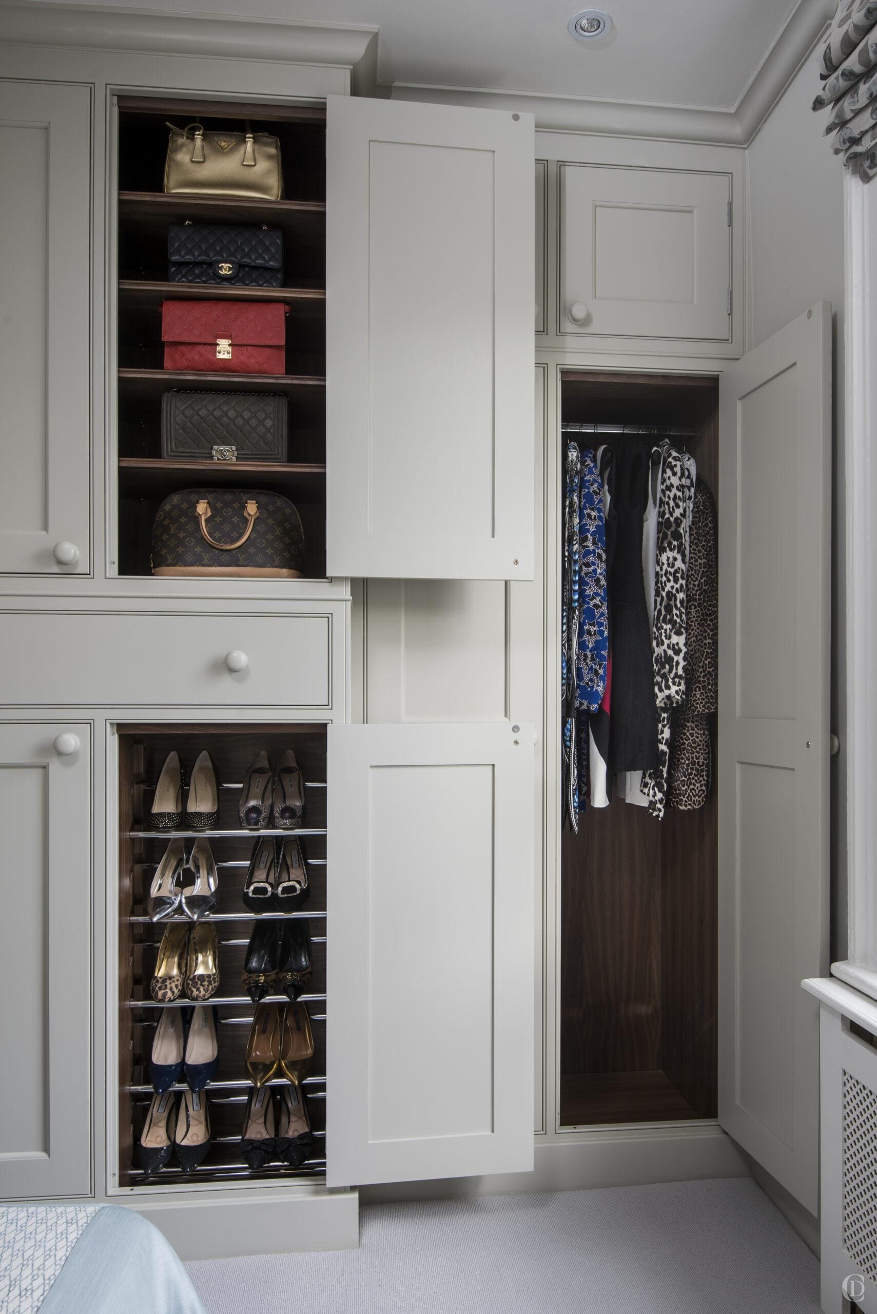
We worked with a wonderful joinery company to realise our vision where the units are constructed in such a way as to allow the internal configurations of the wardrobe’s maximum storage capacity. We used a combination of different sizes of drawers, hanging rails and shoe racks.
The cornice and skirting boards were made by the joinery workshop to run seamlessly around all the spaces. All surfaces were hand painted on site and the internals feature a beautiful walnut veneer and mirrors.
Lighting Design
Less is more
Stripping back all the rooms to the bones allowed us to rewire and prepare a new lighting design. We install only a few targeted lights and we ensure to allow flexibility and prepare several circuits such as reading lights, cabinet lights, internal lights inside the wardrobes, a central ceiling light in the bathroom as well as wall lights. We specify a limited number of downlight spots and where we do, we position them in relation to specific items of furniture, so they have a purpose and they are dimmable.
Bathroom Design
Balance and harmony
The bathroom design was the most challenging space in the project. As is often the case we were limited in our flexibility to swap around the various elements of the room by the locations of waste pipes and the direction of joists.
We worked through variations of layouts and measured very carefully the sizes of each unit to make them comfortable and spacious enough while recognising that we are pinching square meters for the dressing room.
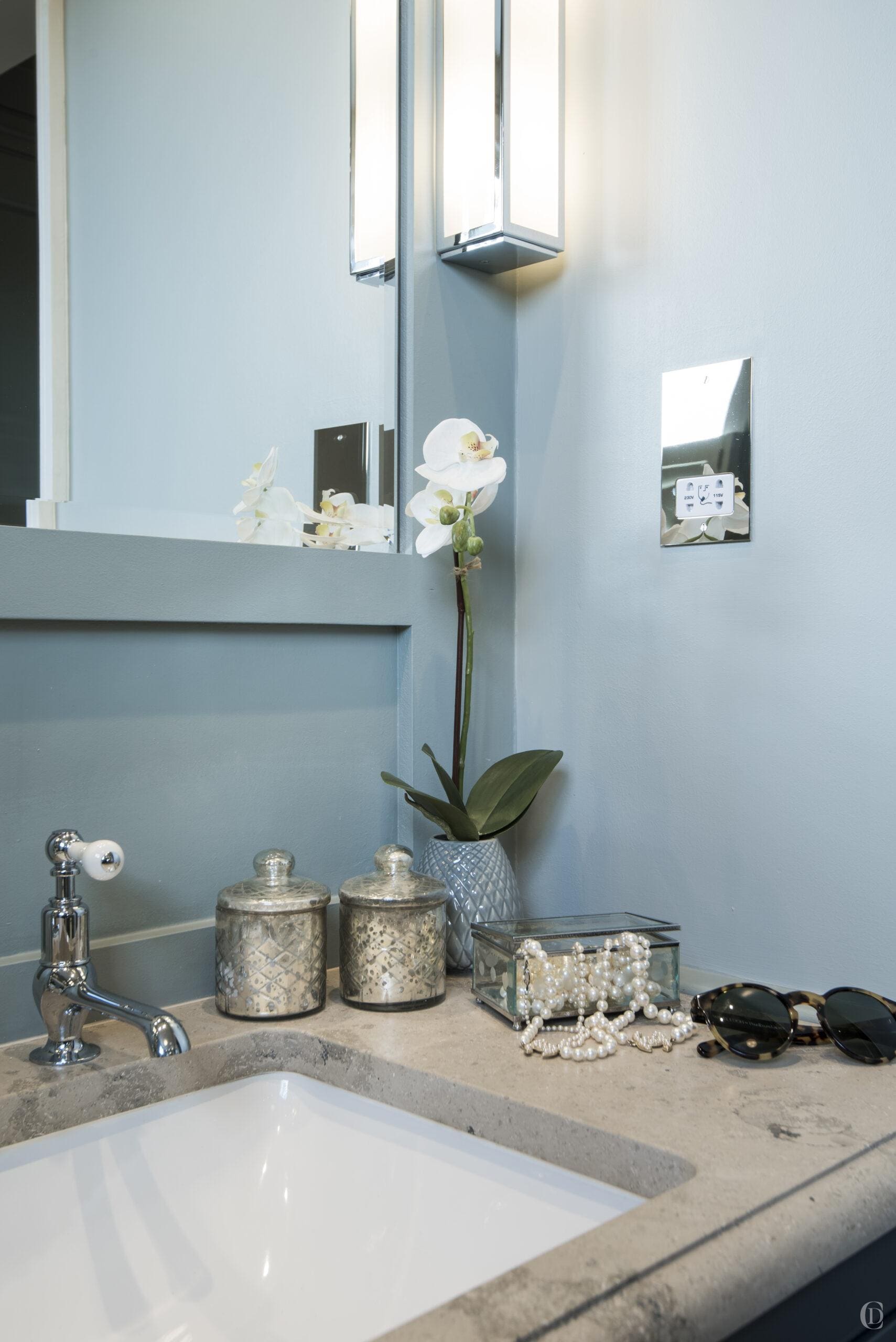
The crucial design feature of the bathroom is the wall panelling – this clever visual trick allows us to break down limited wall space into numerous smaller spaces which then visually makes it appear larger, it’s a very clever decorative device for limited spaces.
