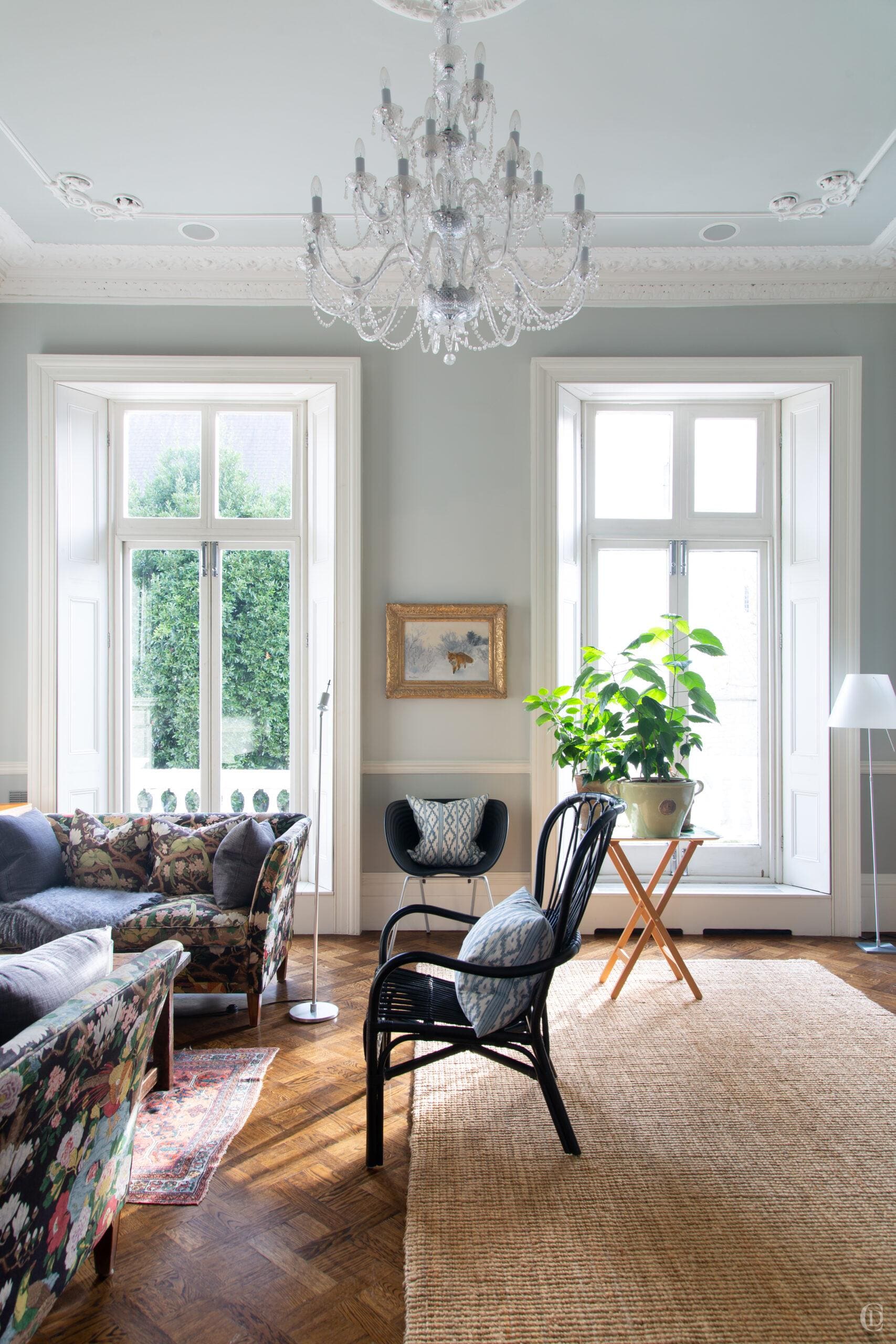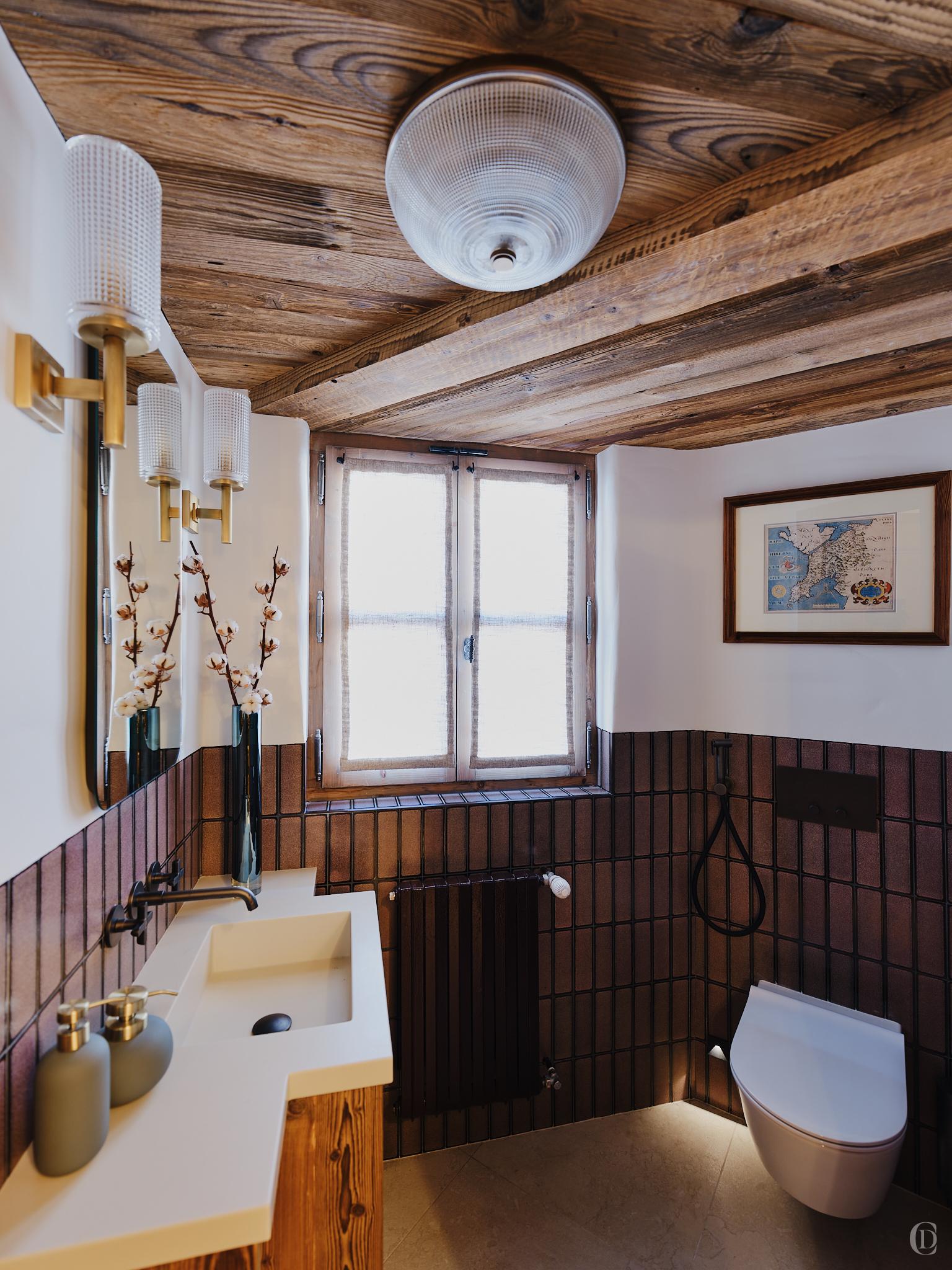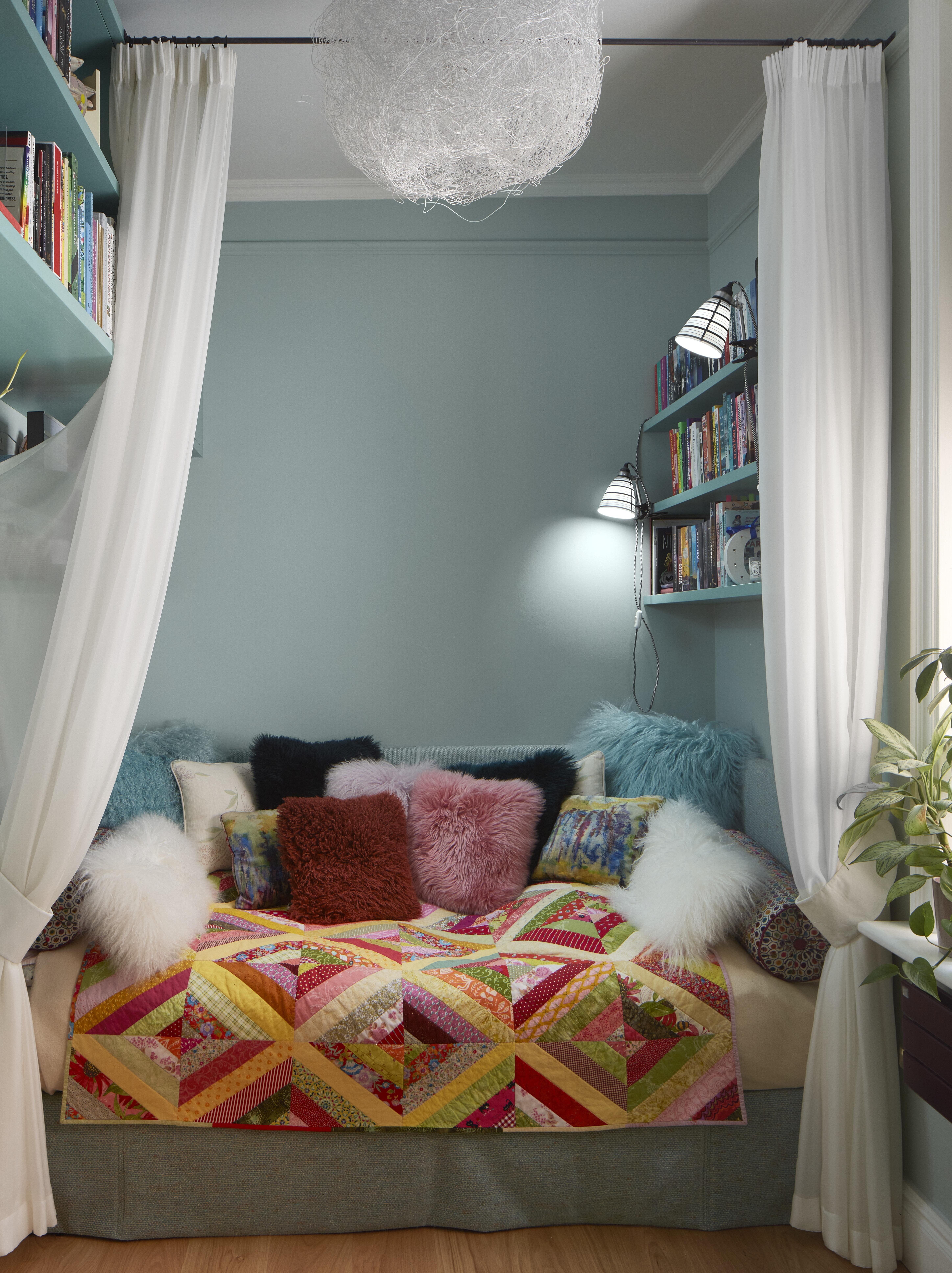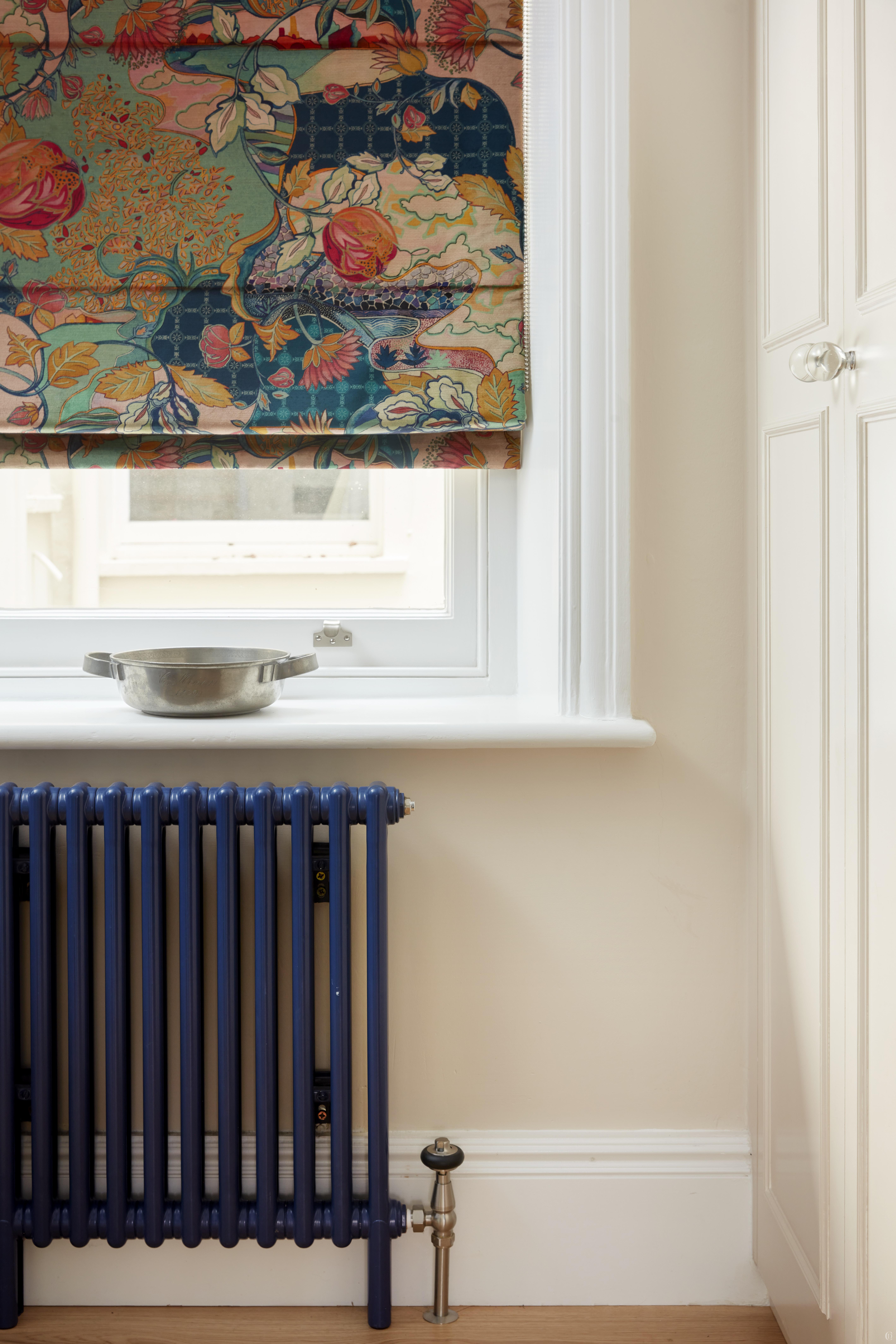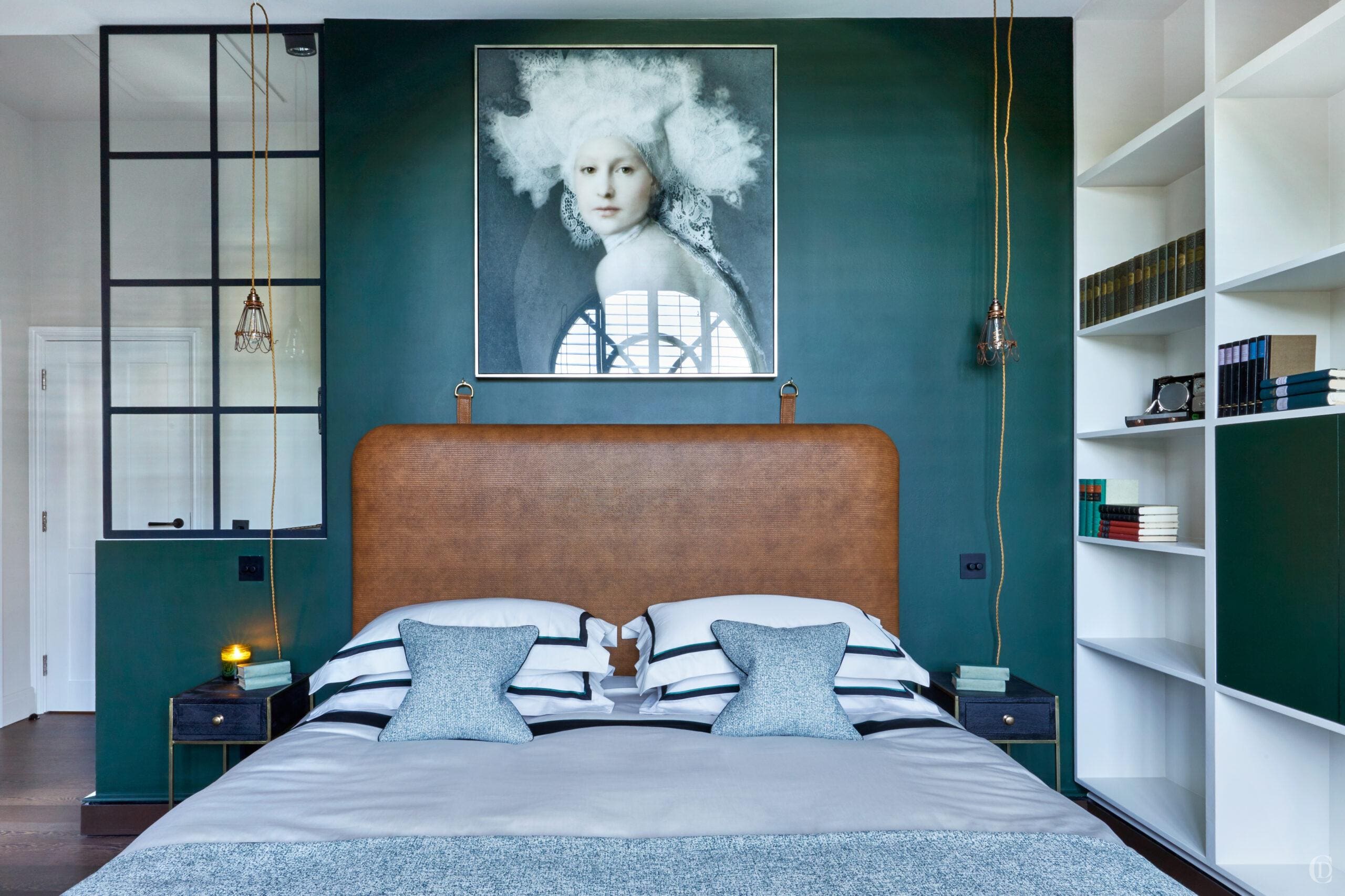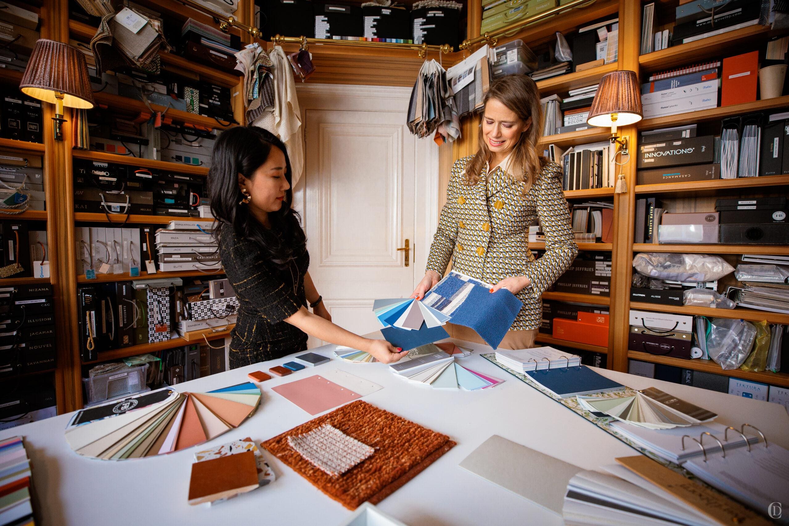
Crafting a colour scheme is not merely about selecting shades that look well together. Before I start a new scheme, I spend time getting to know the clients tastes, existing pieces of artwork or furniture or rugs, we talk about design styles, periods and influences. I hope to learn what atmosphere, mood, story, and experience should be evoked with the colours of spaces we curate. I consider the art of colour as an essential foundation for every room, setting the tone for elegance, balance, and timeless style.
1. Define the Mood and Purpose of Each Space
If you embark on your own on your colour journey, ask yourself what colours you enjoy and make you happy. You can look through magazines and books to discover what tones you are drawn to, but you must also be realistic about your surroundings; what is the nature and period of your property and its habitat (sunny or cool climates) and check what existing belongings or existing features must be integrated. You want to avoid clashes but equally stear clear of a limited palette which will look clinical.
In the absence of existing features which would determine or influence potential colour choices, I start by considering the room’s function. Each space in a home serves a different purpose and those can require distinct ambiances. Often bedrooms are desired as a soothing retreat, on the other hand dining rooms are an energising social hub, or a private is an inviting and intimate cocoon.
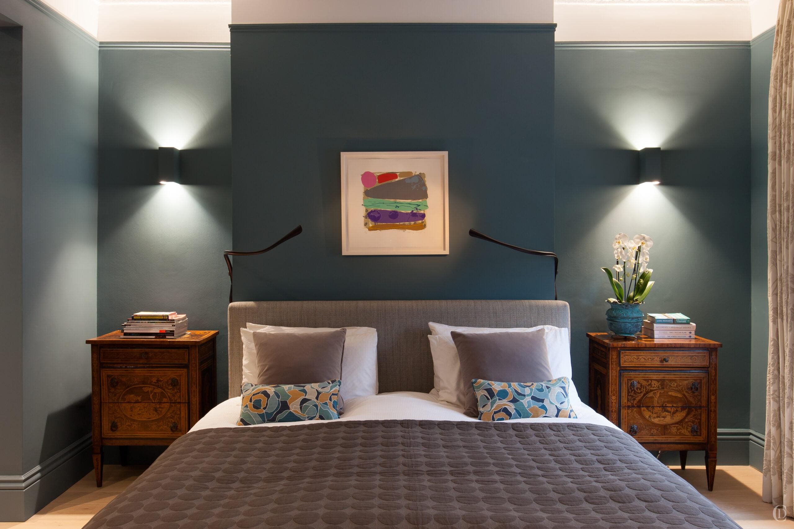
For tranquil spaces we tend to look at options of cool, muted tones like soft blues, lavenders and clay-inspired hues to infuse a sense of relaxation and subtle sophistication, perfect for bedrooms or reading nooks. For lively spaces on the other hand, such as kitchens, dining and living rooms, we can access energy and warmth provided by tones like mustard, burnt orange, shades of red or deep forest green.
We consider how rooms transition from one to another and aim for a colour flow that feels pleasing and restful to the eye. Corridors, landings, and passageways can provide continuity by harmonising with the rooms that lead off them, ensuring a balanced experience throughout the home.
When seeking inspiration, look outside and study your surroundings! Colours like deep taupe, tobacco, ochre, and rust echo nature’s tones and work particularly well in north-facing rooms. Alternatively, jewel tones like decadent deep plum, pinks and reds enhance the light in south-facing spaces, creating depth and vibrance.
2. Harness the Power of Dark Tones in Small Spaces
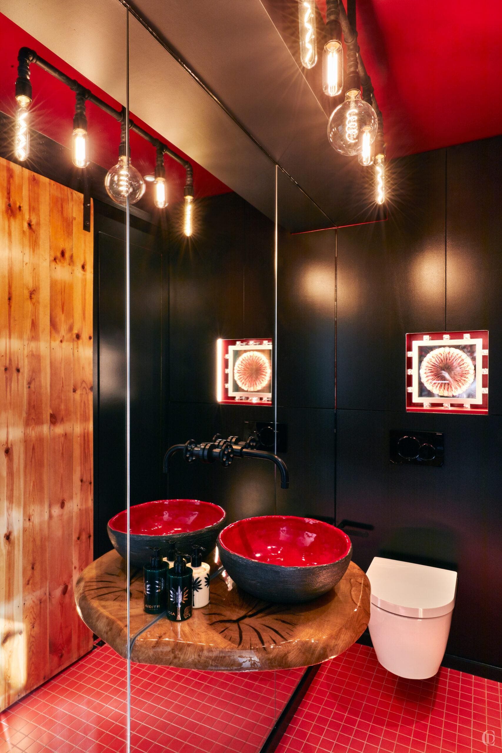
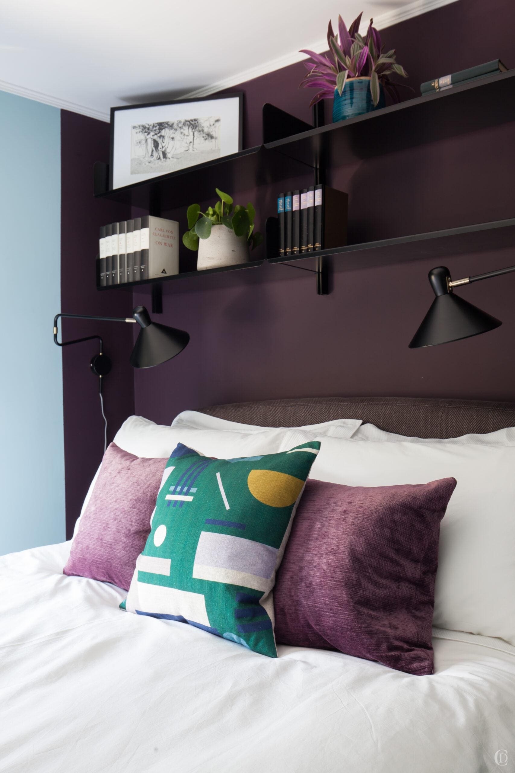
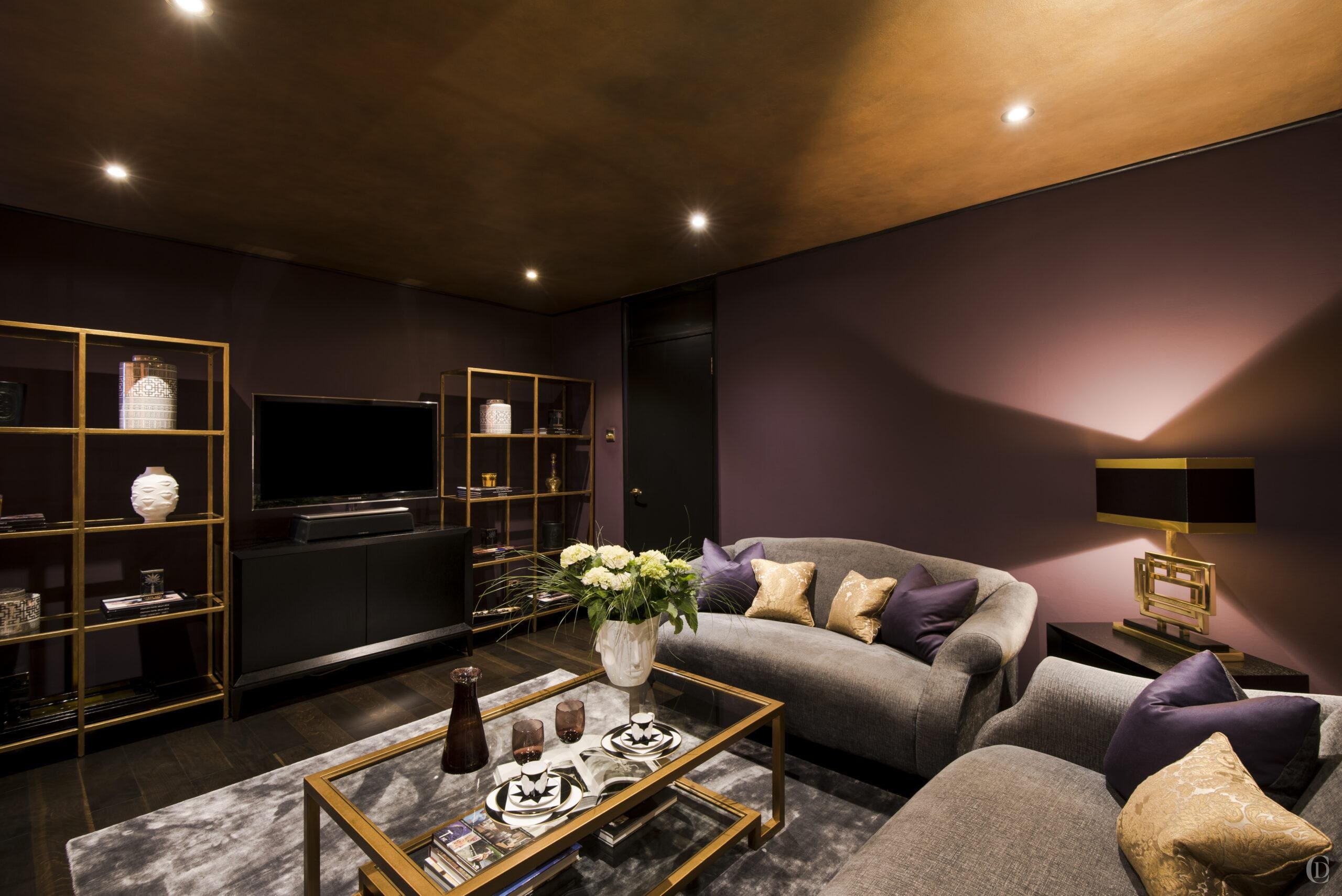
Contrary to intuitive belief, dark shades will make a small room feel luxurious rather than cramped. Deep, rich tones like charcoal, midnight blue, lush green or even deep purple or burgundy will lend a stylish, contained feel to compact spaces. Darker colours evoke depth and warmth, transforming a small room into a cosy, enveloping retreat. We have experienced and tested this on numerous occasions, and clients are always amazed at the transformative impact when they embrace the room’s snugness by opting for bold hues, which create an atmosphere of quiet elegance. For added flair, we like to layer in textures like velvet or mohair and rich deep veneer for joinery to complement the darker tones. Glossy finishes are also a smart choice as they reflect light, injecting panache and creating a striking contrast when paired with rich metallic accents.
3. Experiment with Ceiling colours for Drama
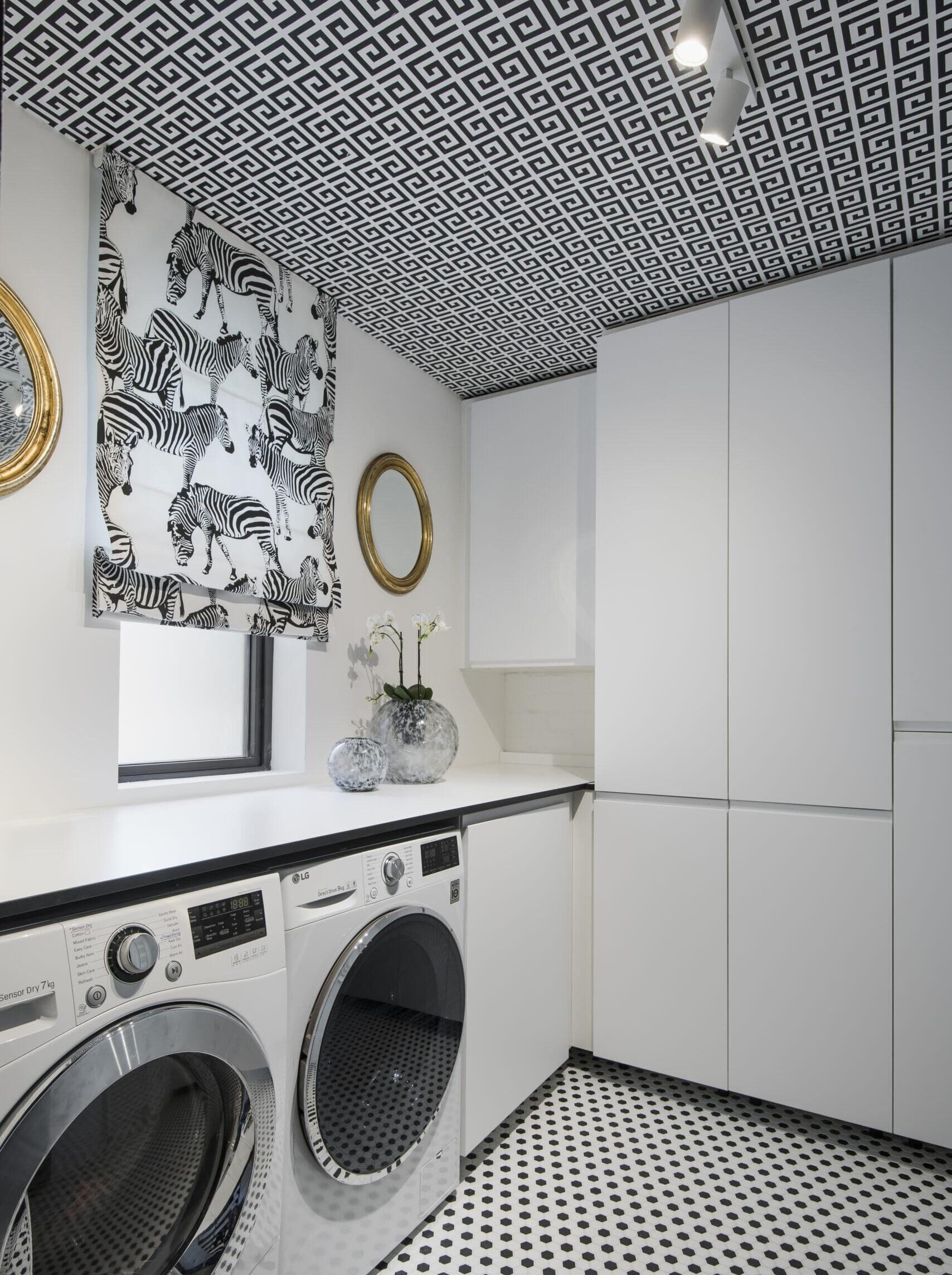
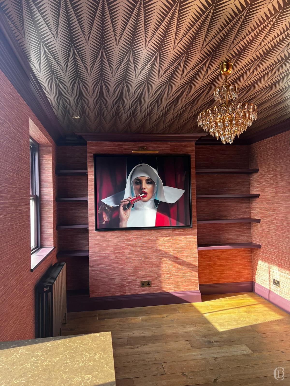
Ceilings are often overlooked, yet they can be used creatively to add contrast and drama. Painting a ceiling in a dark shade or even in gold grounds the space and brings an unexpected edge to the design. Another favourite decorative trick is to add a painted design (such as a tented ceiling) or applying wallpaper or glossy paint to the ceiling. The ceiling treatment must complement the atmosphere and purpose of the room and if curated correctly this additional surface (similar to paintef floors) is a valuable expense.
We have paired patterned ceilings with rich textured wallpapers, dark cabinetry and a statement rug for an elegant, cohesive look. It’s a bold choice that can transform a room when carefully integrated with complementary elements. Adding geometric black-and-white patterns – whether on the floor, rugs, or tiles – can further enhance a room’s modern, edgy flair while anchoring its visual drama.
Remember to collect your ideas on a pinboard or layout all your samples and ideas on a large table. You should avoid making spontaneous decisions in isolation without regard to the entire scheme, the purpose of rooms and flow of spaces as you transition through the property; you dont want the rooms to feel like punches thrown around.
4. Consider how to Paint Architectural Features
A traditional look would call for skirtings, architraves and doors to be off-set from the walls, typically in a shade of white. This is a classic look which works well for large properties to create cohesion and a common language. Nevertheless exceptions can be granted even in the same house; if appropriate for particular rooms, then you can colour drench all surfaces.
For a seamless, sophisticated and some might say more contemporary look, consider painting all architectural elements – such as cornices, skirtings, and panel mouldings – in the same colour as the walls – or just a touch lighter or darker. This technique allows the architecture to blend subtly into the room’s aesthetic, giving prominence to furniture and artwork. Using a single colour (or using the ‘Architectural colours’ in shades from 1-5 by Paint and Paper Library) across walls and architectural details creates an uninterrupted flow and an elegant backdrop, whether in period properties or contemporary spaces.
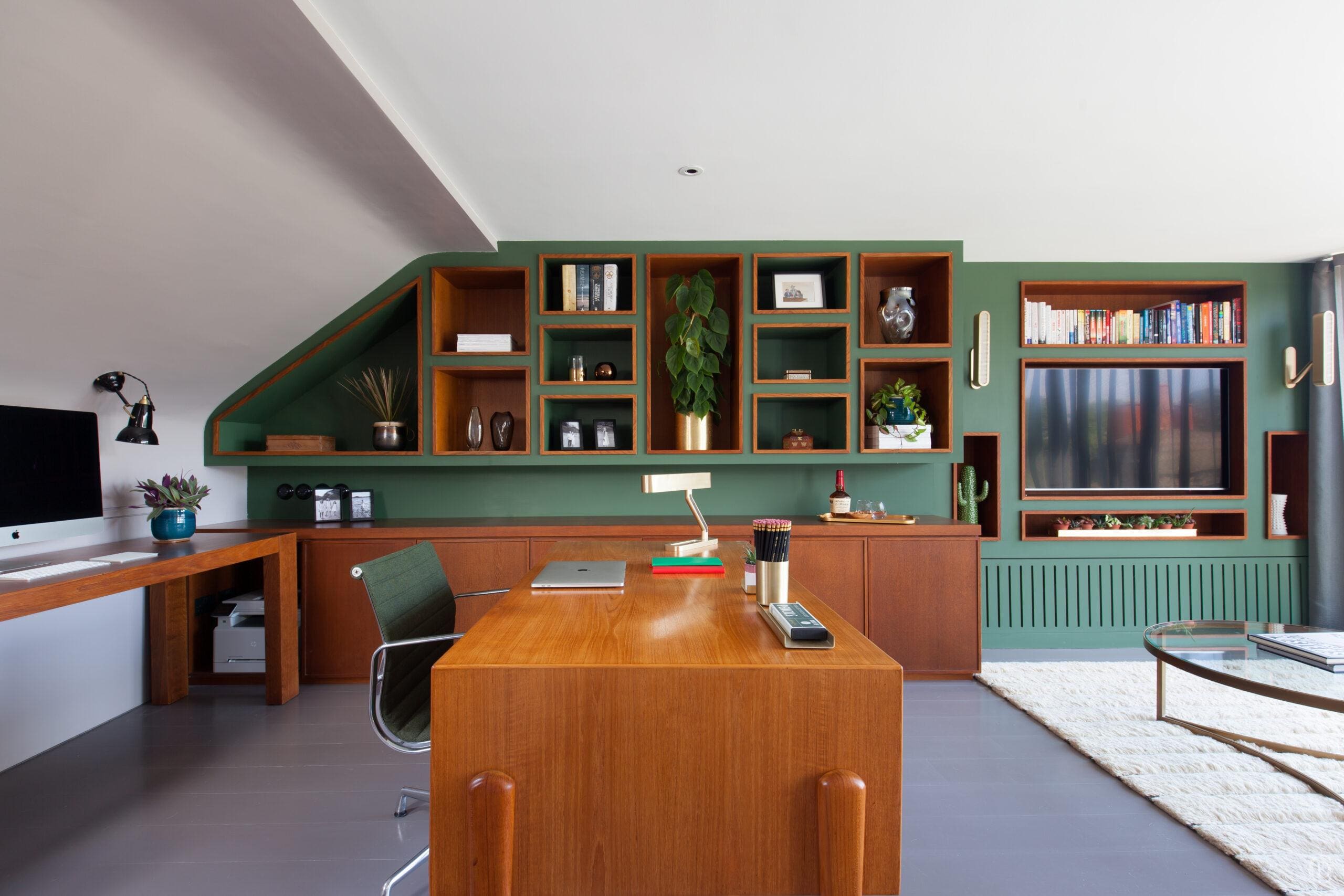
This subtle cohesion allows other features in the room to shine. Rooms which will be fitted with large streches of joinery on one or more entire wall lend themselves to this technique of ‘drenching’the entire wall in the same or only subtly graded tone. Rather than running bands off setting around the room, chose two colours for entire sections of the room (as shown in one of our Georgian projects). Another variation would be to paint these elements in a much darker shade (try black) or yet an entirely complementary vibrant colour; techniques which we have tried and tested in different schemes over the past two decades ; depending on the purpose of the room and the overall effect of the property.
5. Use Nuanced Neutrals as a Foundation
White may feel like a safe choice, but overuse can make a room feel cold. Generally I recommend softer neutrals like offwhites, greige, taupe, or light clay as base colours. These add warmth, depth, and versatility, giving your room a sophisticated foundation without overwhelming other colours – try using these softer neutrals in place of white for ceilings, trims, or cabinetry to introduce subtle warmth and a refined, cohesive feel throughout the room. I work with many brands and we have their full colour books in the studio which means we can easily compare A5 size swatches and then match those with other materials. For a comprehensive list of brands look to the end of my article.
Finding the right shade for your space requires some effort and browsing many options and I often mix brands on the same project, unless we require a particular type of finish; such as limewash paint from Bauwerk or Linseed oil paint for wood from Linolie. For neutral shades I am increasingly using magnolia shades, peach, and butter tones. These light neutrals symbolize purity and balance while reflecting natural light, which can positively impact mood. In current projects we combine them with materials like light oak, ash, and organic fabrics like linen, flax or hemp for added texture and depth.
6. Mix Warm and Cool Tones for Depth
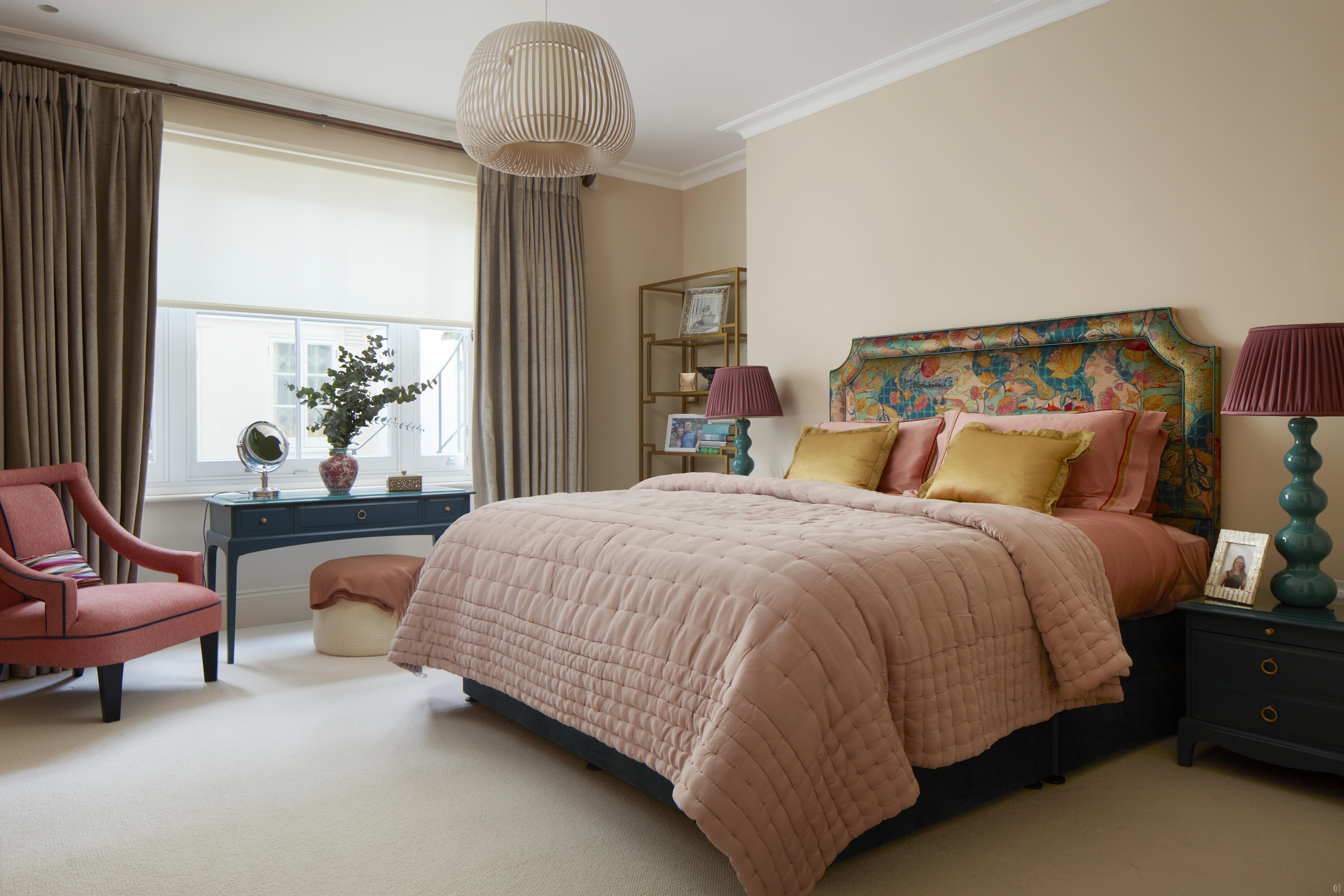
Layering warm and cool tones creates depth and a harmonious atmosphere. Warm tones such as clay, ochre, or deep red add comfort and intimacy, while cool tones like lavender, sage green, and slate blue offer freshness and tranquillity. For example, a room with lavender walls can be complemented by clay-inspired accents, creating a pleasing contrast. The blend of cool and warm tones adds dimension and a sophisticated balance to the space.
Soft blues are universally loved for their restful quality. They’re an excellent grounding colour, pairing beautifully with both vibrant shades and muted neutrals, providing endless layering possibilities. Blue shades also work beautifully with vintage and antique furniture, often in aged shades of veneers of mahagony, walnut, cherry, pine or oak. If you have been following my work for a while you will know that I love incorporating somethinng blue and something old in my schemes as they really ground a home; as well as books, plants, pictures, and not to forget small pinches of black and red are always a must, even if just in the spines of the books or the paint in an artwork.
7. Highlight Key Features with Colour
Colour can draw attention to focal points in a room, adding a sense of intention to the design. A bold, unexpected hue on certain elements like skirtings, cabinetry, or even a single furniture piece can create a striking feature. Necessary evils like radiators can be much enhanced if painted in bold colours or matched to the walls. I very often replace (and /or move) radiators and i ensure each one is coloured to suit its room ; if I can change them then they are definitely not white throughout the house! Consider adding patterned or coloured lampshades as an easy way to introduce colour without a major commitment. Thoughtfully placed accents will enhance the room’s uniqueness, infusing personality without overwhelming the overall scheme.
I love deep burgundy and aubergine tones, they add a luxe sophistication and are a very versatile colour. We can pair these with textural neutral, green shades or pops of red for an intriguing, layered effect.
8. Plan for Flow Between Rooms
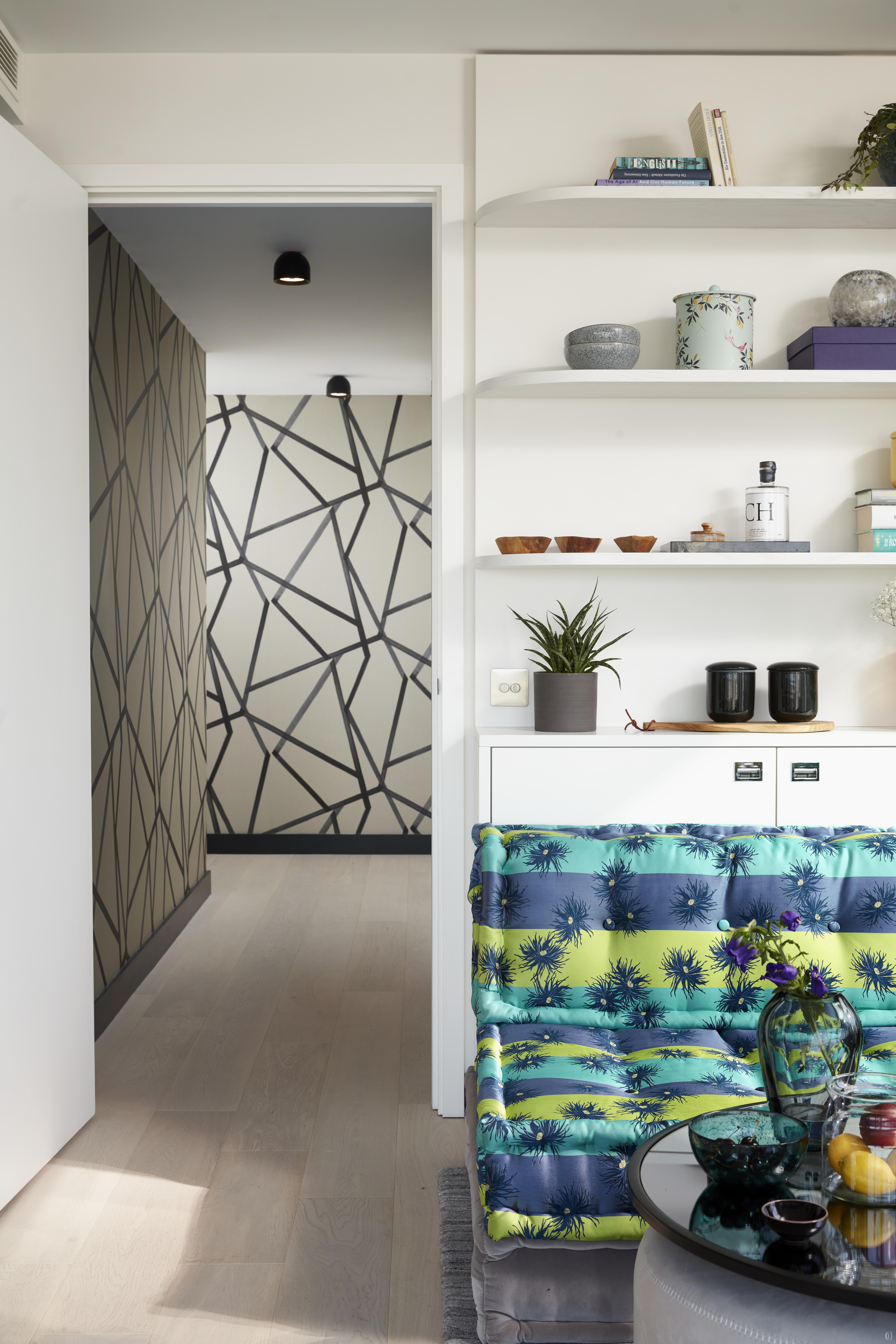
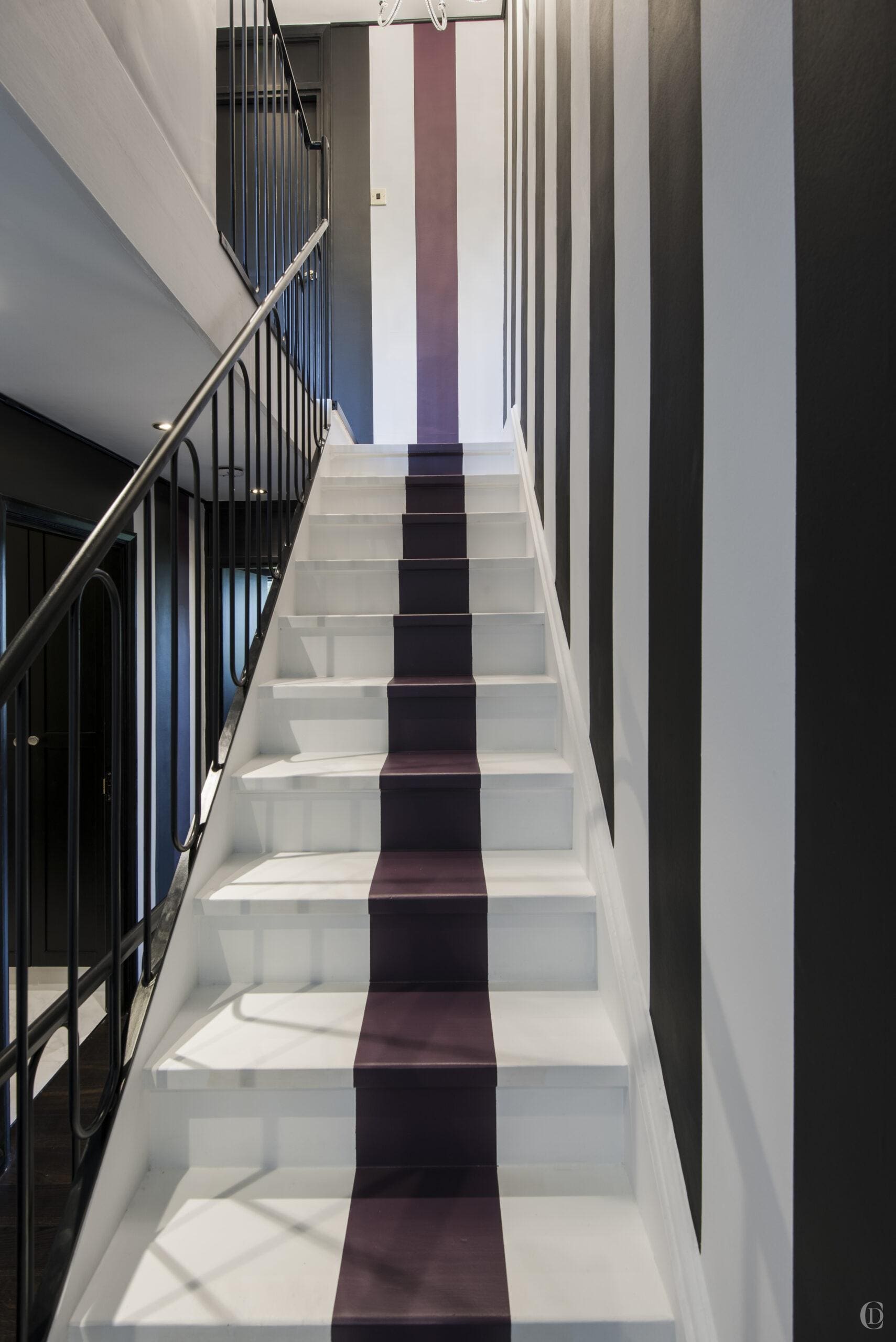
When selecting colours for multiple rooms, I ensure that we think about how they will flow from one to the next. You might either want to achieve an uninterrupted flow of colours between adjoining spaces which creates visual harmony and enhances the home’s cohesive feel or you might want to use the transition space to add drama and interest. For homes with rooms connected by large areas of halls, staircases, and landings I treat those as spaces – they are not an afterthought, they can function as interesting spaces in their own right: create a dramatic nook in a dark colour; install a long shallow bookshelf wall in an offset colour; create a gallery wall on a deep rich shade; apply a bold patterned walpaper – whatever you decide, be intentional.
While I am keen on preserving and considering flow and progression, I also favour the occasional pop of unexpected colour to create a delightful surprise without disturbing the overall flow, adding intrigue and personality to your home.
9. Claudia’s Little Black Book
There’s no one-size-fits-all approach to colour. Discovering the perfect palette requires much research and comparison. If you enjoy colour and really want to fall in love with your rooms’ paints then please take time to order sample cards and pots and paint at least A4 size sheet of lining paper and hold them up to different walls (as the light changes so does the effect of many paints). Consider the entire property, avoid isolated decisions. Buy some books on colour theory and colour schemes. Or even better contact me for a personalised colour consultation because when I work with clients we never just talk about paints, we will look at the entire interior landscape and I will advise on room layouts, lighting and much more.
If you are going to search for paints, then these are my goto brands which I work with regularly:

10. Understand How Lighting Affects Colour
Finally, lighting significantly impacts how colours appear, changing throughout the day and under artificial sources. A shade that looks warm in daylight can shift to a cooler tone under artificial light, so testing colours in the room under different lighting is essential. My tip is always to adapt to light sources: In rooms with ample natural light, cooler shades can work beautifully as the sunlight will warm them up. For darker rooms, warmer tones add comfort and balance. Layering lighting sources – ambient, task, and accent lighting – helps fine-tune colours and allows for flexibility as the lighting changes from day to night. If possible use the lights which will be in the room to test your colours. Colour can shape a room’s architecture and reflect light, lending each space its unique character. Even when you have painted your A4 cards, beware that the final impact can still surprise you, if you are planning to paint very large areas it is better to start with one pot and paint one room, or one part of a staircase – it can be hard to return paints. And also don’t be afraid to change your mind, if a room doesn’t turn out to your liking, just change the paint, it is much easier done immediately than when all the protection is gone and the furntiure is back. Life is too precious to make a compromise.
Colour consultation isn’t just about picking a pretty palette – it’s about creating a space that feels right for you. After all, the right colours can make a room feel like a warm hug or a burst of energy. Think of me as your personal colour whisperer, guiding you through shades that speak to your soul, elevate your home, and leave you feeling like you’re living in a space that was made just for you. Because when it comes to colour, it’s not just about looking good – it’s about feeling good, too.
Stay inspired, stay sophisticated
Love, Claudia


