City Pied a Terre
Interior architecture | Hampstead

Homes designed around your Lifestyle
Our clients are entrepreneurs who had lived in NY for some time and when they returned to London, they initially rented this apartment. They love the area which is very close to Hampstead Village and the Heath where they enjoy the fresh air and muddy fields to walk their dog. When the owners decided to sell the property, the couple bought it with a view to beginning a process of organising their family around two main locations. We were appointed to turn this apartment into a comfortable informal city home suited to serving their lifestyle during the working week while keeping in mind that ultimately weekends and raising a family would evolve in larger house on the south coast.


INTERIOR ARCHITECTURE
Making the most of the outside
The apartment occupies an enviable position benefiting from stunning views on the first floor of a large freestanding Edwardian property on a quiet green residential street. The clients love the outdoors – hiking, walking, cycling and naturally it was paramount to design our scheme to maximise the connections of the interior spaces to the outdoors.
Claudia did this in several ways. We knocked out the kitchen wall to create an open plan kitchen staircase which now floods light through apartment. We redesigned the terrace doors to reduce from 4 to 3 leaves which can open 180 degrees, eliminating glazing bars and simplifying the design which increases light and viewing and connectivity between kitchen and terrace.
We raised the floor level on the terrace to meet the kitchen and used the same natural stone inside and outside which now creates a continuous space. In order to truly make the most of the glorious terrace we installed a bespoke awning with three heaters which are both remote controlled so there is hardly an excuse not to use the outdoor space.


INTERIOR DESIGN
Modern English infused with hints of Moroccan charm
There were only three existing pieces to inform the scheme of colours, textures, fabrics, tiles, lighting and furniture we selected for this home – a walnut wardrobe, a pink Andy Warhol sunset screen print and an antique marble top escritoire – and the requirement that fabrics had to be dog friendly and entertaining should be informal.
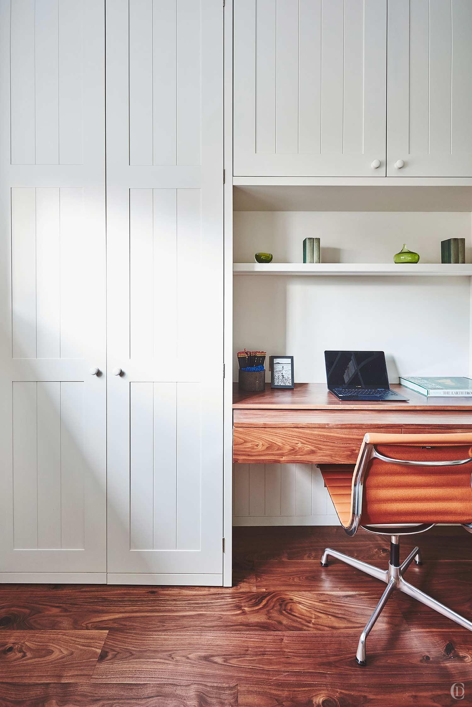
Through close collaboration with the clients we discussed and prioritised between conflicting requirements. The study offers a very spacious working desk and wardrobe space as well as a hand-made bespoke pull out sofa for overnight guests.


Simple foundations
We carefully calibrate the selection of flooring, paints, wood, tiles, fabrics and furniture surfaces and finishes to achieve a harmonious but intricate scheme which meets the design brief.
To create calm continuity, we only used two types of flooring throughout – walnut parquet in the main rooms and grey limestone in the bathrooms, halls, stairs, kitchen and terrace.
We used walnut veneer on the new joinery and stained all the existing oak doors throughout in walnut tones which we then paired with shades of pink to purple, strong blues, some green and soft greys.
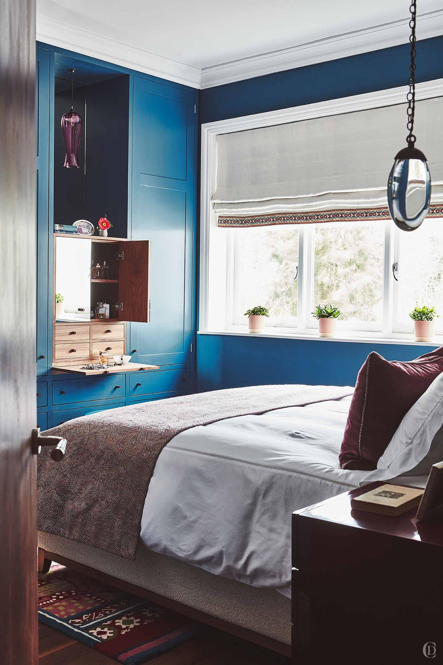
In the master bedroom, deep blue walls and a colourful rug are offset with large surfaces of crisp cream on the bed and window and paired with beautiful irregularly glazed pink and white tiles in the master bathroom.


Layered Finishes
Once we have picked the hard materials and paint colours, we layer the scheme with soft furnishings, furniture and accessory details.
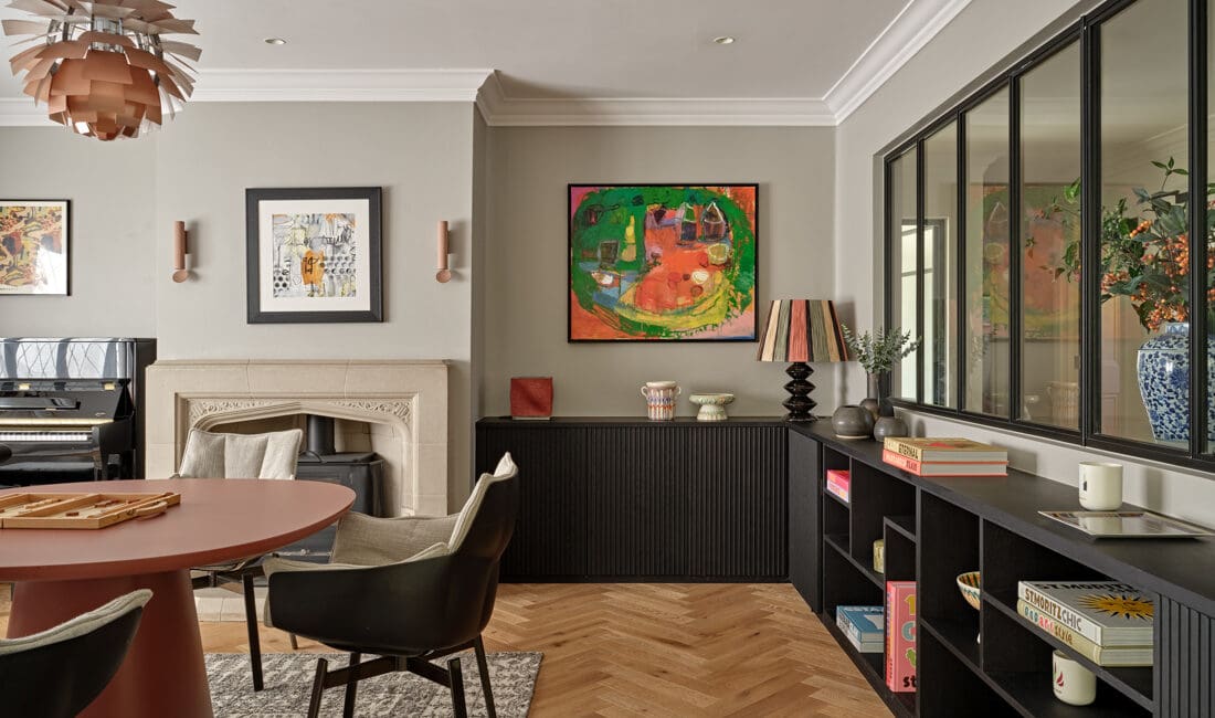
The living room is a feminine palette of soft pink, greys, deep purple and large areas of cream and whites on the sofas, the silk rug and bespoke bookcases. We mix textures and periods to create a personalised ambience. The silk carpet with Marrakech star motif meets the clients’ request for a Moroccan vibe.
The study has a more masculine feel to it where green dominates which helps to bring in the outside as this is the darkest room of the apartment. Large areas of cream joinery with splashes of red and blue on the sofa and blind pick up the accents throughout the home.



BESPOKE JOINERY
Using every inch of space
As a rental, the apartment had never been equipped with storage suited to accommodate long term living and lacked wardrobes, drawers and shelving in all rooms. Claudia is passionate about creating bespoke solutions that meet exactly the clients’ requirements. Faced with limited floor space we began a process of meticulously planning and drawing every inch of space in the kitchen, hallways, bathrooms, bedrooms and living room.


Fit for purpose
In the kitchen we designed every unit for a specific purpose – even a home for Amber’s dog bed, a utility area and floor to ceiling storage accessed by a ladder.
In the master bedroom suite, we moved walls to create space for a walk-through wardrobe with sliding doors, a pull out dressing table and Moroccan inspired, mirrored walnut vanity units.
In the living room we opted for two extra large free- standing bookcases to house a large television with soundbar and AV equipment, a home bar, crockery, glasses and a vast library of books.
In the study, where space was very limited we still created a spacious wardrobe and desk with pull-out surface to accommodate extra wide PC screens. A curved bookcase hugs an awkward shaped wall and using sliding doors allows space for a sofa bed.
Tailored joinery is one of hallmarks of Claudia’s designs.


