Victorian Townhouse
Interior architecture | North London
INTERIOR ARCHITECTURE
Mid Century Inspirations
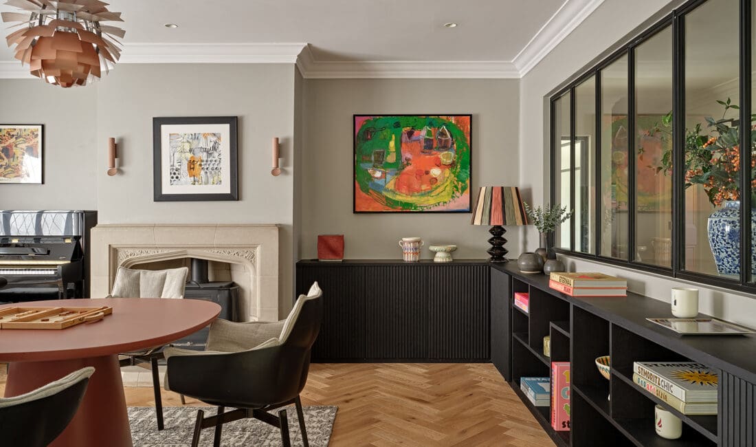
A young professional couple appointed us for a turn key property renovation to create a home which would accommodate a growing family. The design brief was to develop a unique and fresh scheme marrying Mid Century inspirations while preserving the Victorian architecture of the building. We were responsible for the design, tender and project management and we worked with structural engineers to ensure the planning process was adhered to.
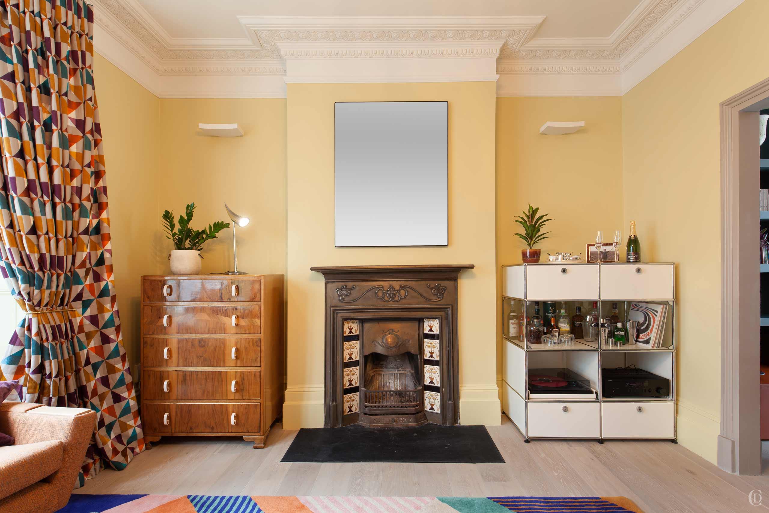
Architectural Details
After careful consideration of the spaces and the owners’ lifestyle and work in the home we set about reshaping the floorplan and allocation of rooms.
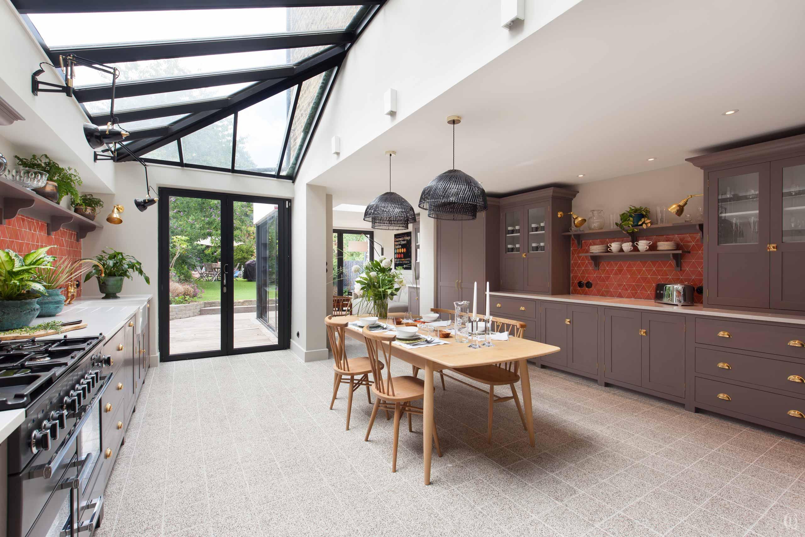
With few exceptions, the house was gutted and our structural engineers designed steelwork to remove chimney breasts in the rear rooms on two floors which allowed us to design a completely revamped bespoke kitchen and master bathroom layout.
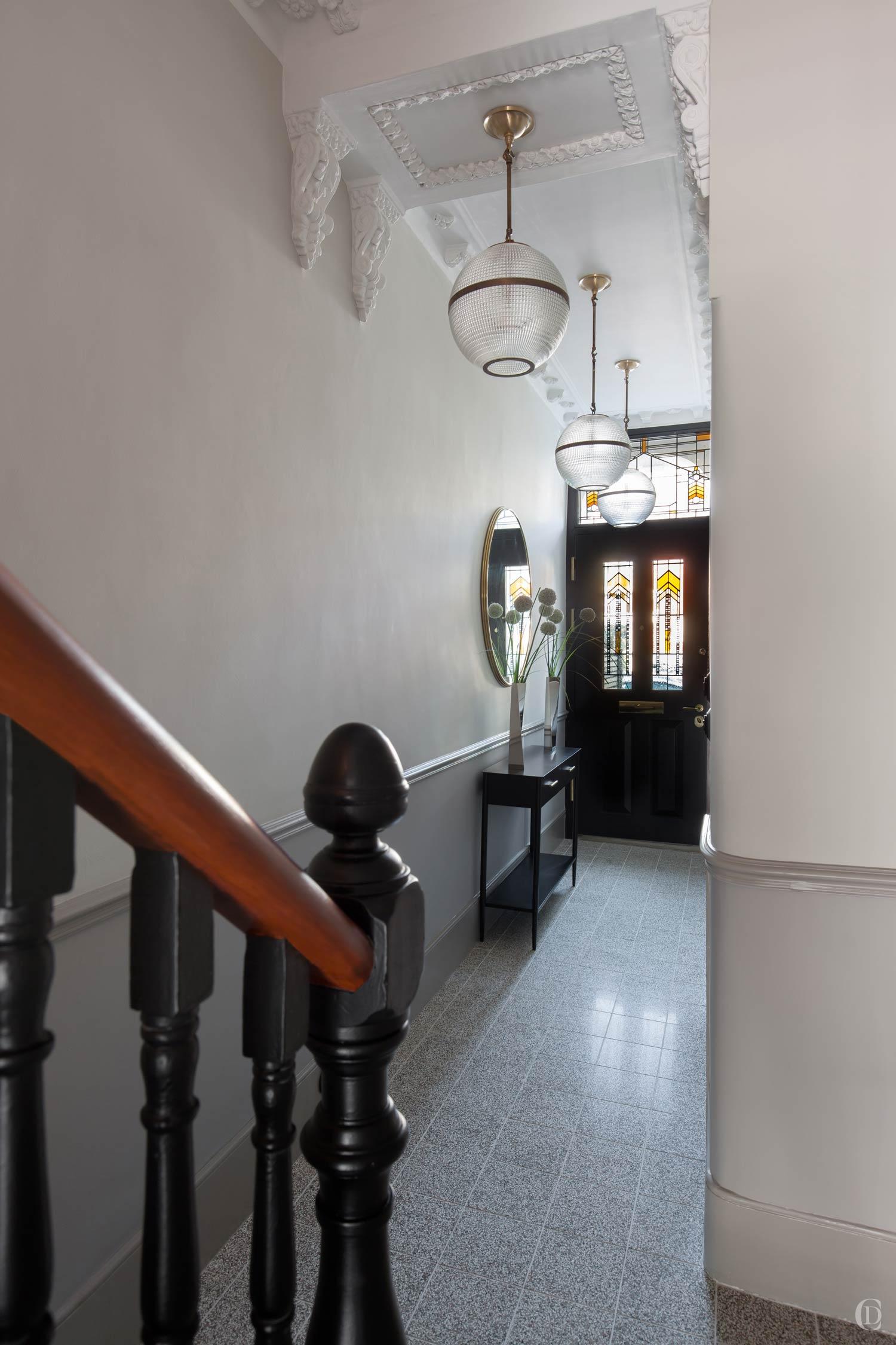
Only a small section of the property retained attractive period features in the hallway which were painstakingly cleaned and repaired and then copied and reinstated in other rooms to create a consistent architectural language throughout.

INTERIOR DESIGN
Top picks
Initially Claudia helped the clients chose key pieces of artworks which then served as a guiding thread throughout the design process. Then we selected colours, shapes and materials to fit with the midcentury inspired style. We take great care in fine tuning the entire palette of hard and soft finishes. Over several months, we plough through hundreds of samples of tiles, paints, fabrics and ironmongery until we find the perfect combination which is agreed on the moodboard.
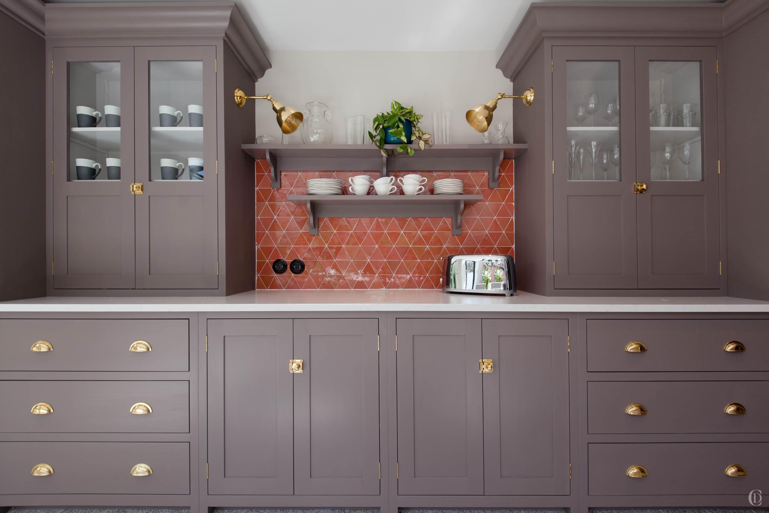
One of the key features are the terrazzo floors, Moroccan zellige and concrete tiles which offer beautifully handcrafted variations in colouring and were used in the entrance hall, kitchen and bathrooms. Wooden floors throughout the house were painted or stained to create a softer look. We selected a palette of pastel 1950s colours paired with dashes of darker dramatic paint accents to feature artworks and accentuate spatial details.


BESPOKE JOINERY
Taking inspiration from the past
Creating custom made and unique joinery for each client is one of the hallmarks of Claudia’s design skills. This property is a testament to the versatility and creativity we bring to each project. We research the period and style which is given by clients brief. We sourced vintage teak sideboards which we turned into vanity units in the bathrooms. These pieces then inspired our designs for wardrobes and bookcases, crafted with teak coloured stained oak and caned panelling. All bespoke furniture was designed inhouse and produced by our contractors.


Multi-purpose rooms
Following the initial analysis of the house, we determined that the master bedroom is moving to the first floor at the front which benefits from high ceilings and a beautiful bay window. The next door office was turned into a bedroom that will become a nursery and a small bedroom at the rear was improved by removing the chimney breast and turned into the master bathroom. A small WC was enlarged and fitted with beautifully bespoke joinery to hide the laundry room. Allocating functions and rooms with limited space always presents a trade off and we work with clients in great detail through various options of space planning to find the balance that will best serve their lifestyle ahead.


Collection of individually selected treasures
Working to a defined budget, we complemented and repurposed existing pieces with a curated selection of antiques, art, vintage and modern furniture and lighting. Claudia’s goal is that each home in the end is a true reflection of its owners’ tastes and inspirations and that it feels and looks organically grown and lovingly assembled over time. We added upholstery made in local workshops and commissioned furniture to our mid-century inspired designs. Together they create a stimulating and harmonious flow through the home which meets the expectations of this young couple and their plans for a growing family.


INTERIOR ARCHITECTURE
Swapping places
The bright top floor roof extension was once the master bedroom suite. We stripped out all the poorly executed room dividers and opened up the floor to create a spacious office man cave. We designed a continuous suite of fitted joinery including a multi-screen desk with plenty of office storage and display shelving, a fully fitted bar corner and a cinema style TV sitting area for movie nights.


