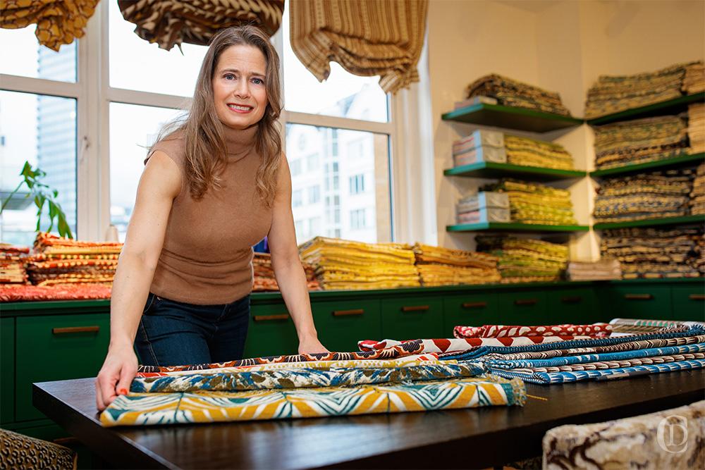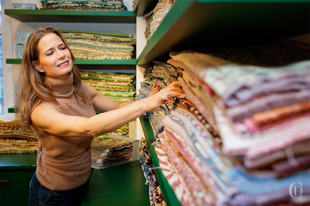
Mixing patterns is a bit like cooking without a recipe – there’s intuition, experience, and a whole lot of tasting as you go. And over the years, it’s become one of the things I love most about interior design. Patterns can tell a story, evoke memories, and bring a space to life in a way few other design elements can. But let’s be honest: doing it well takes a bit of finesse. When it works, it really works. And when it doesn’t… well, we’ve all been there.
If you’re wondering how to mix patterns without ending up in visual chaos, here’s everything I’ve learned (and learned again) from trial, error, and countless design projects.
1. Colour Is Everything
If I could only give one piece of advice, it would be this: let colour guide you. It’s the first thing your eye catches, and the secret ingredient that brings everything together.
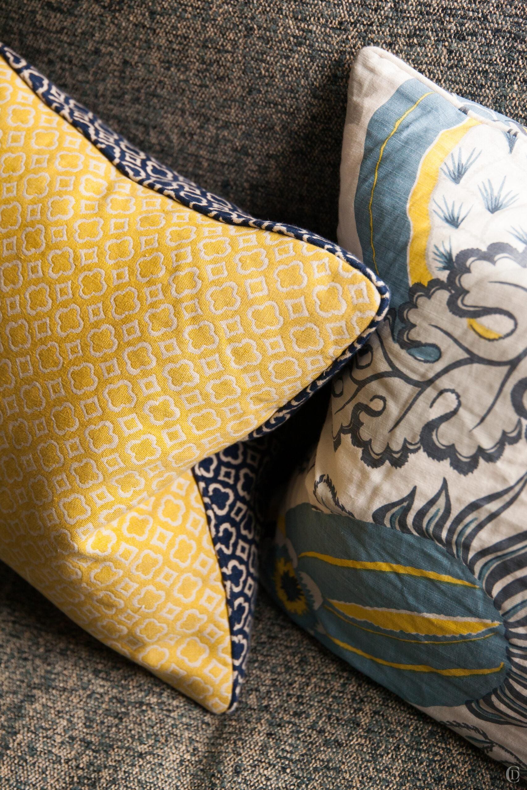
Start with a dominant colour. This is your anchor – the shade that will quietly (or boldly!) pull the entire space into harmony. Whether it’s a smoky navy, a rich mustard, or a soft, creamy neutral, pick a colour that speaks to you. From there, every pattern in the room should feature at least a whisper of that hue.
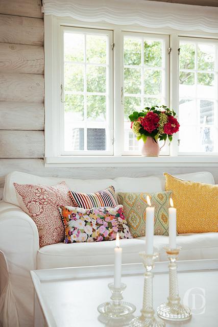
And please don’t stress about perfect matches. Patterns don’t need to look like siblings – they just need to get along. A burgundy floral cushion can absolutely vibe with a striped ottoman, as long as there’s some colour crossover. I often find that if I trust my eye – and not just the colour wheel – the results feel more layered and personal.
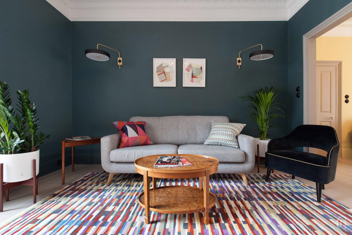
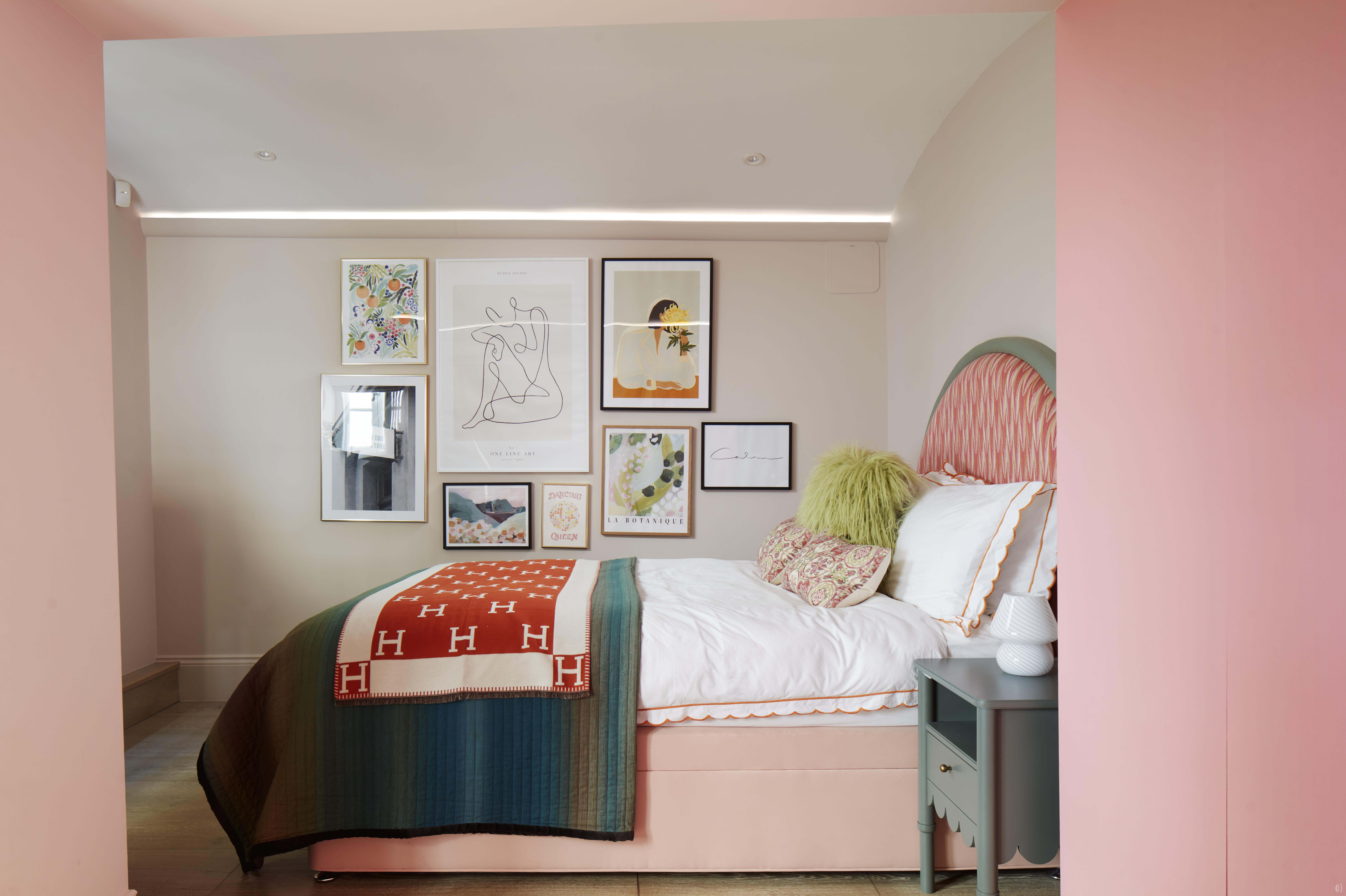
This pink city bedroom draws colour and texture and pattern not just from the fabrics (notice the scallop details in the bedlinen and the bedside table) mixed with geometrics and abstract shapes in the artwork. When we deploy our arsenal of patterns we need to think beyond fabrics (although I LOVE fabrics) but we can work with the rugs, artwork, shapes of furniture, wallpaper and even architectural shapes and patterns on doors, ironmongery, tiles and flooring patterns.
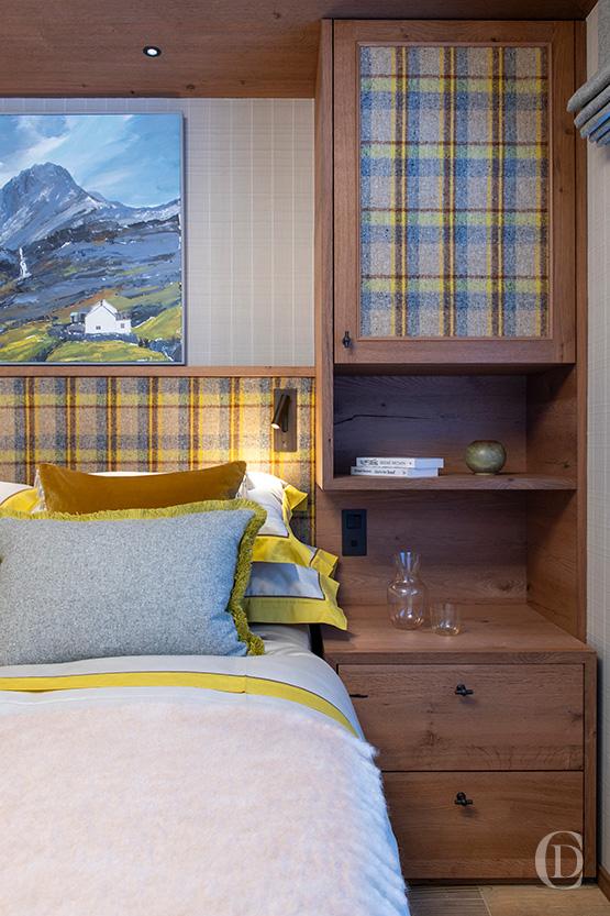
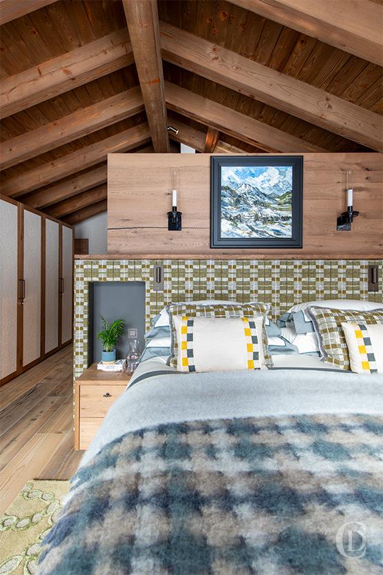
This chalet bedroom draws inspiration from the nature outside the panorama windows dominated by shades of green , grey and blues. Here we curated the geometrics of the headboard and throw with organic swirls in the rug and complemented the textured finishes with the artwork colours. While all the tones seem very harmonised the pops of yellow on the cushions break it up and I find this is an effective strategy to introduce one pop of colour which may be repeated in other rooms (which is the case in another bedroom) so there is a thread as rooms are linked by colour , texture and pattern.
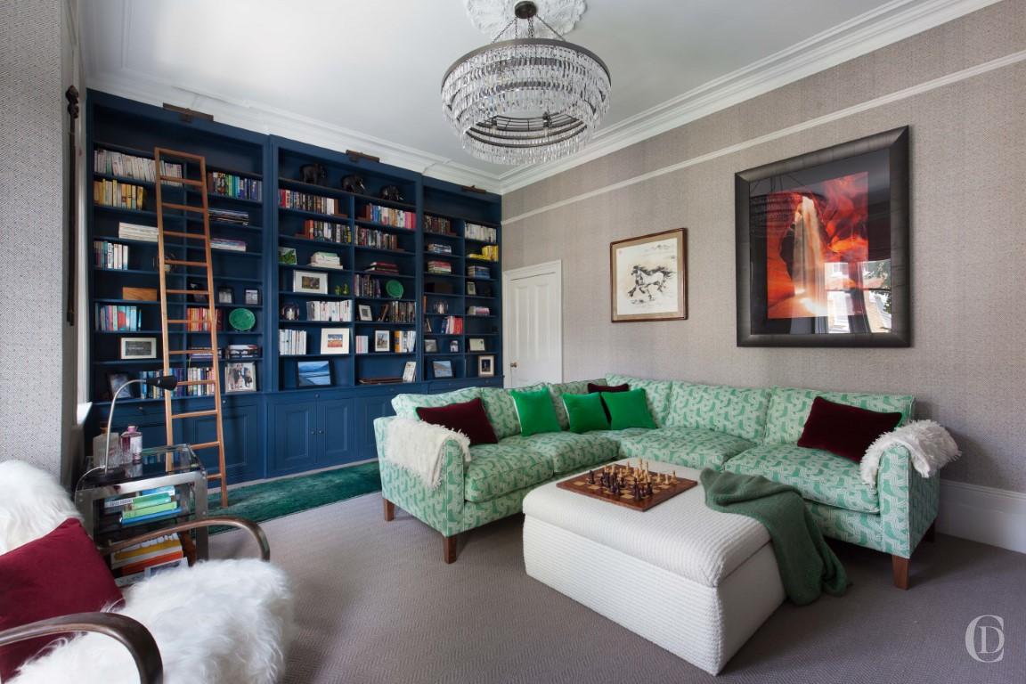
One of my favourite tricks? The “patchwork sofa”. In smaller rooms where you need to be bold but careful, combining different patterns within the same colour family can create something totally unexpected and showstopping. It feels playful, curated, and just a little bit rebellious (in the best way).
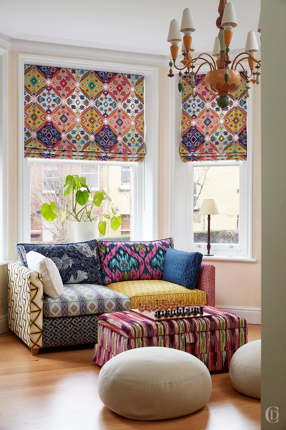
2. Scale Isn’t Just for Architects
Mixing scale is essential. Without variation in pattern size, a room can easily feel either chaotic or flat. The key is balance.
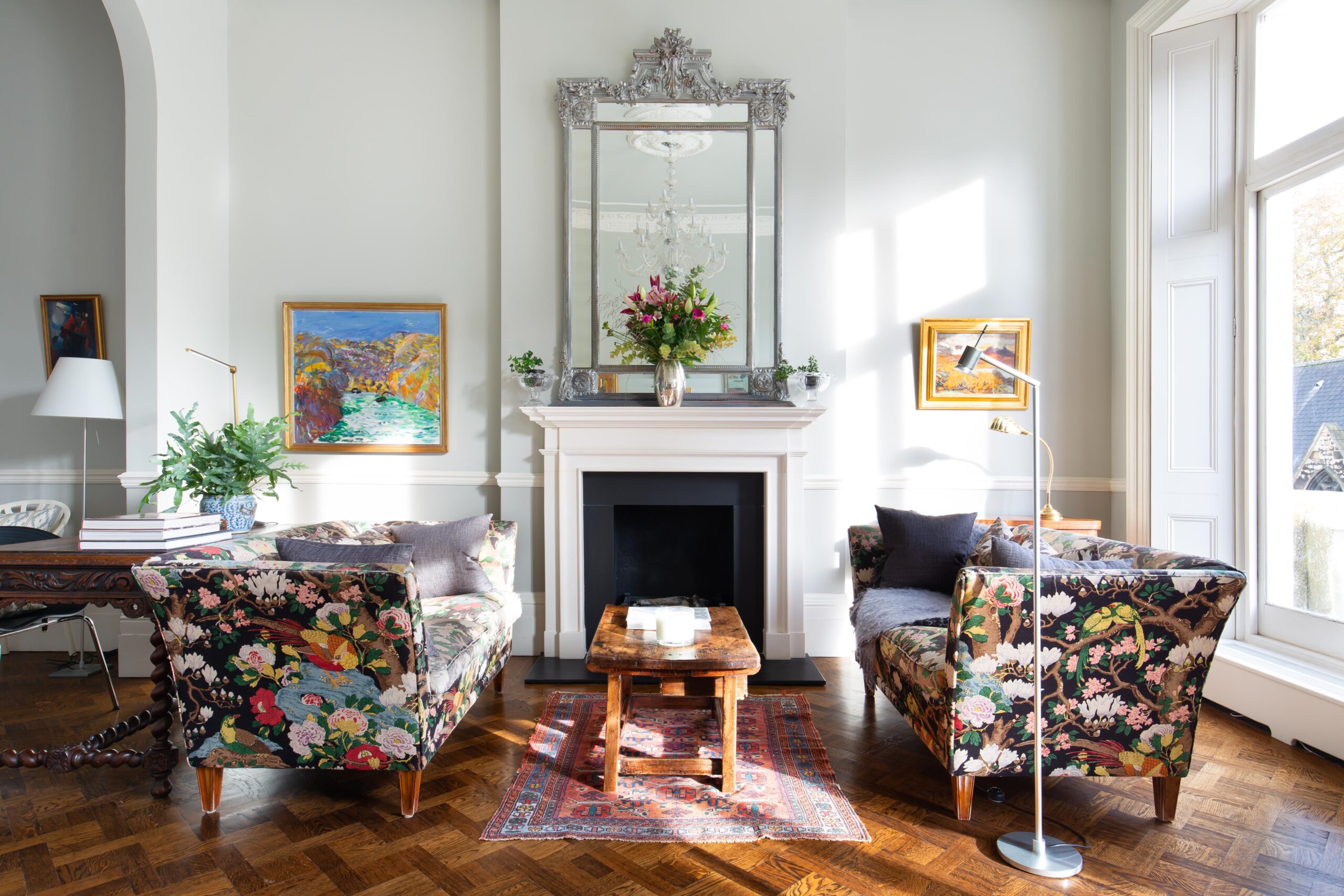
I typically anchor the room with a large-scale pattern – something bold and expressive, like an oversized floral or broad stripe. This becomes a focal point, and from there, I build around it using smaller-scale patterns that provide contrast and support. Think fine checks, narrow stripes, or delicate motifs. These create interest without competing. A simple guideline: pair one large-scale design with one or two smaller patterns in the same colour family. It’s an easy way to create dimension and rhythm while staying visually grounded.
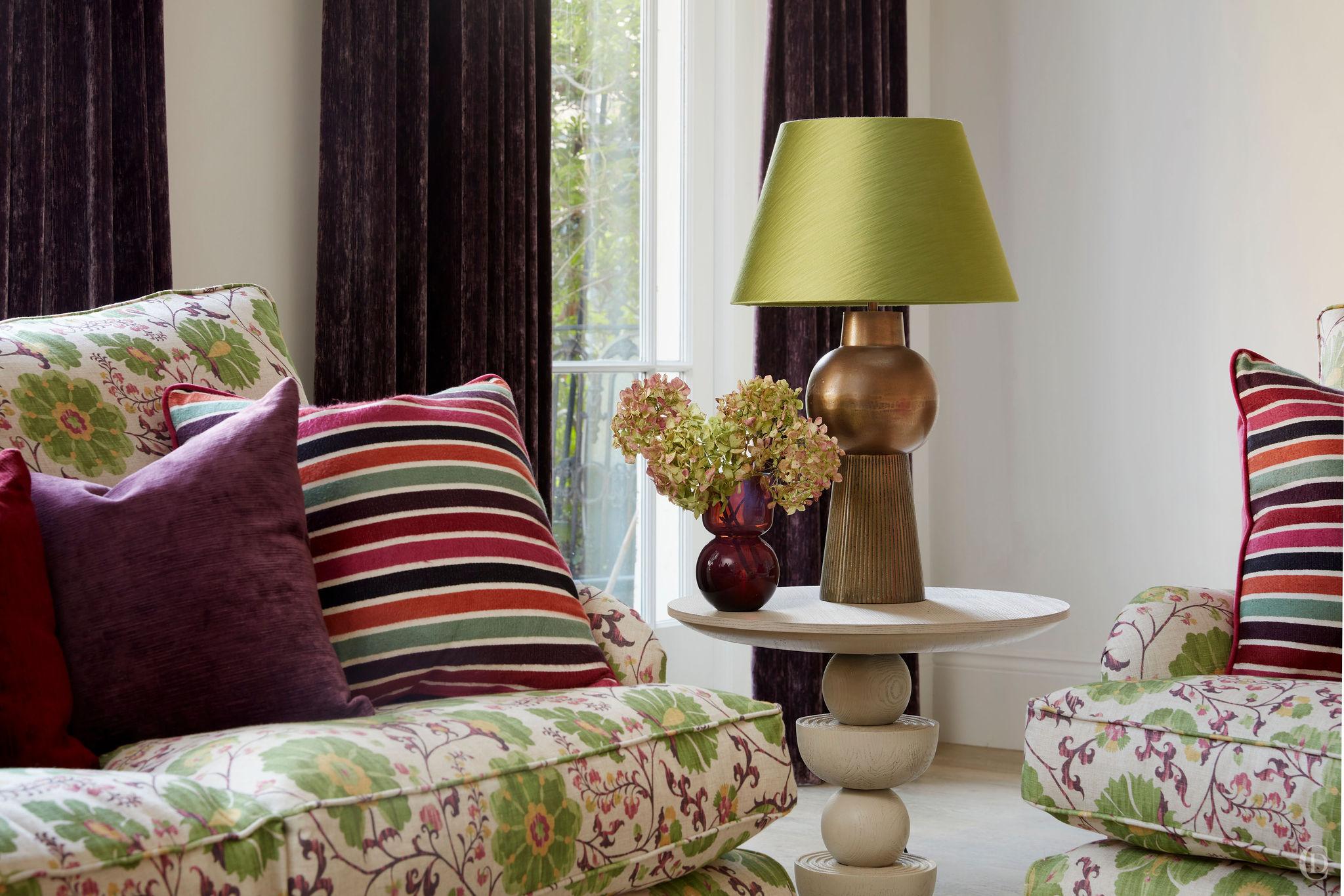
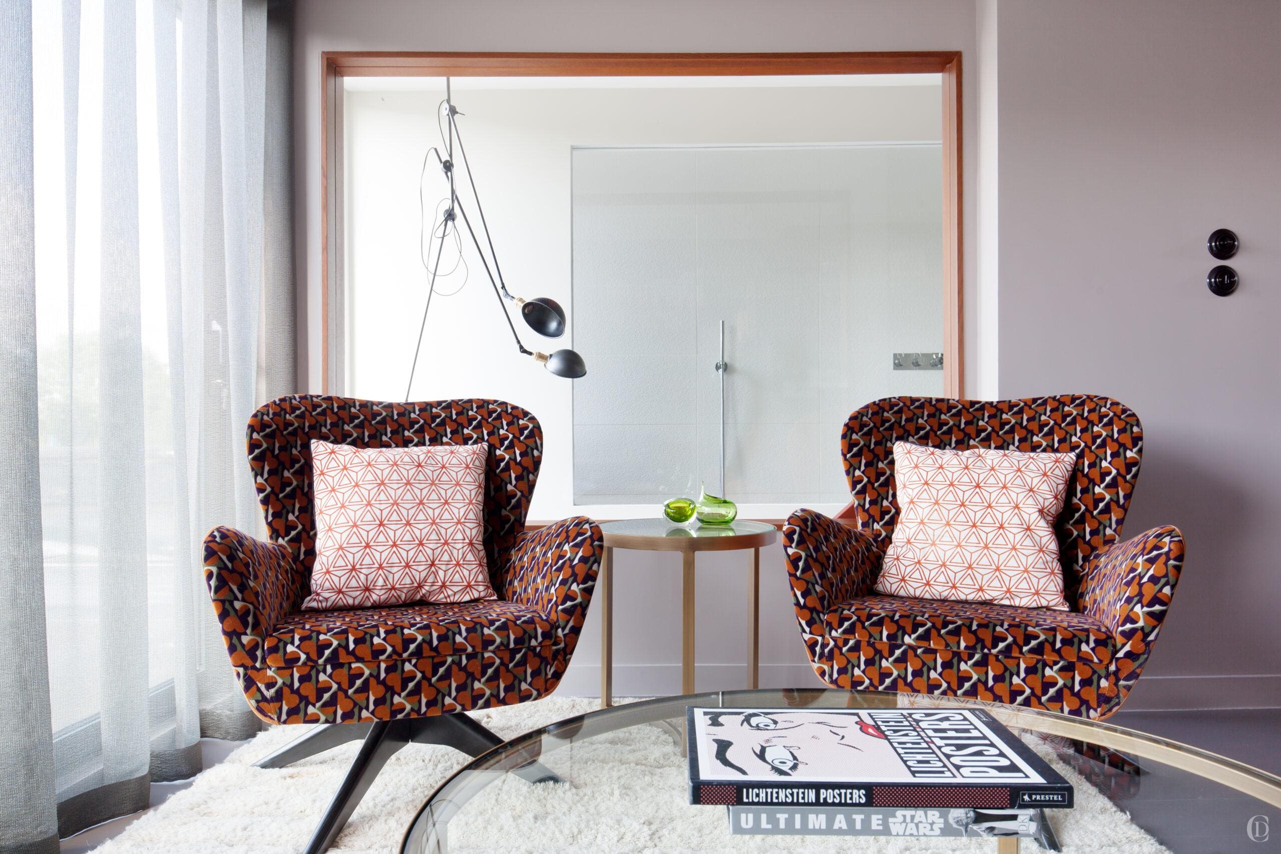
I am particularly fond of using a bold patterned sofa fabric especially when we buy good quality bespoke seating or recover an existing piece. When you consider your opportunities for employing patterns in a room your options are: curtains (although more often this might be blinds which are pulled up hence revealing less whoom) , walls (love a patterned wallpaper and this is challenging to pull off when mixing with other patterns) , rugs and your other larger upholstered pieces- mainy your sofas and chairs. Patterned sofas are foregiving, interesting and much more enveloping than plain sofas. Just test it out if you dont believe me.
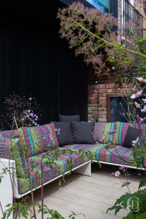
And while we mention sofas, beautiful patterns are now available for outdoor fabrics , like this vibrant pattern from Pierre Frey, most fabric brands now have gorgeous patterned even textured outdoor fabrics.
3. Texture Brings It to Life
While colour and scale set the framework, texture adds the soul. It’s the dimension you feel – not just see. And when you’re mixing patterns, texture plays a critical role in keeping the space from feeling flat or overly decorative.
A printed pattern on velvet reads very differently than the same design on linen or cotton. Velvet adds depth and elegance, while linen softens a print and makes it feel relaxed and lived-in. That tactile variation brings patterns to life in a way flat design simply can’t.
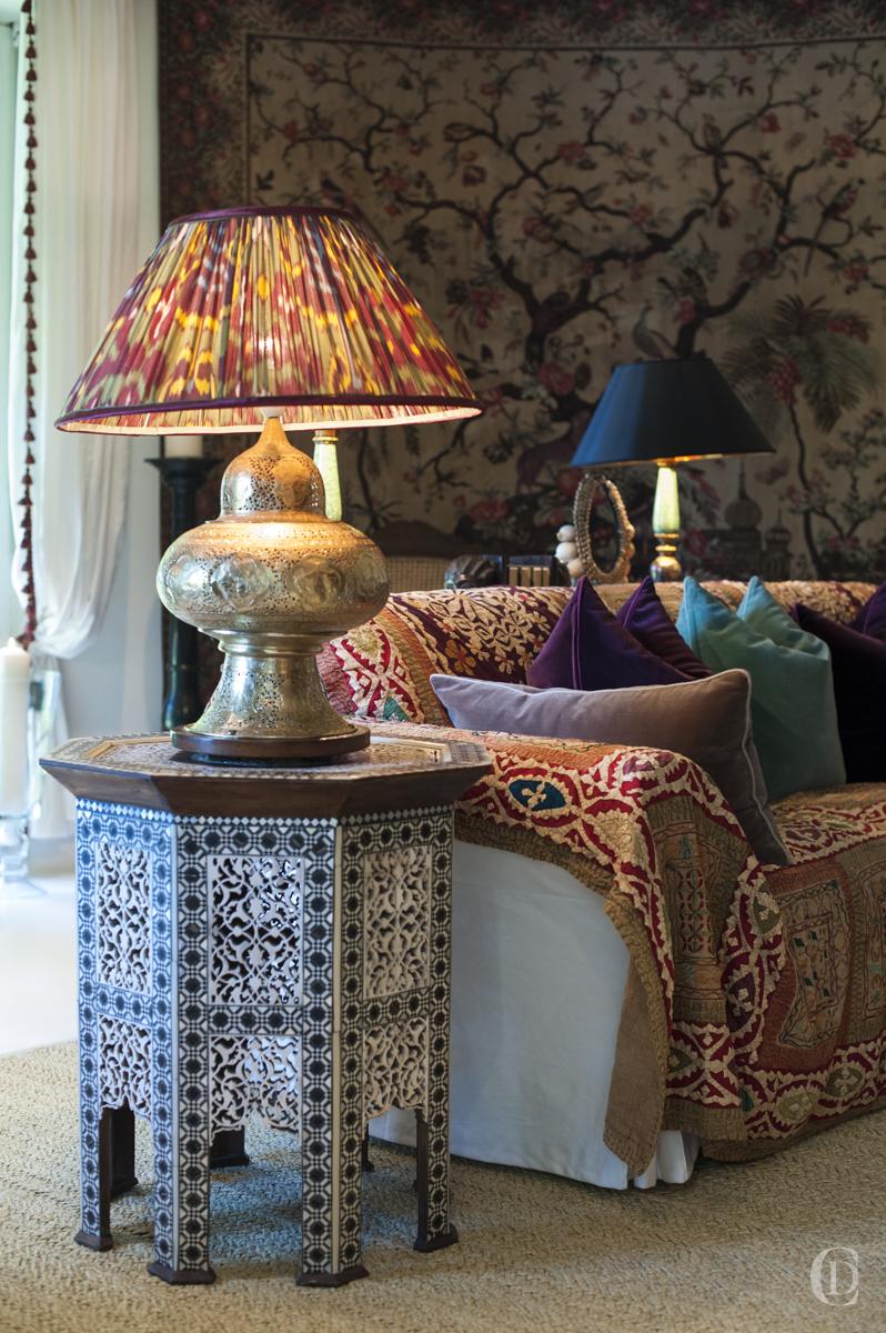
I often recommend combining natural materials – like wool, silk, linen, and cotton – to create nuanced layers. For example, a textured wool throw on a patterned cotton armchair introduces quiet complexity, even if the colours are muted.
Brands like Pierre Frey do this beautifully – layering texture with pattern so seamlessly that the fabric almost tells its own story.
4. Understand the Families of Pattern
Patterns fall into broad families, and understanding how they behave helps you combine them with confidence. I tend to think of them in four categories:
-
Geometric: Structured, modern, and orderly. Stripes, checks, herringbone – they create visual clarity and pair well with more organic designs.
-
Floral: Soft, romantic, and timeless. Can be bold or understated depending on scale and colour.
-
Abstract or Organic: Loose, expressive, often asymmetrical. These patterns add movement and spontaneity.
-
Animal or Textural Prints: Earthy and often dramatic. These can add a sense of sophistication or playfulness, depending on how they’re used.
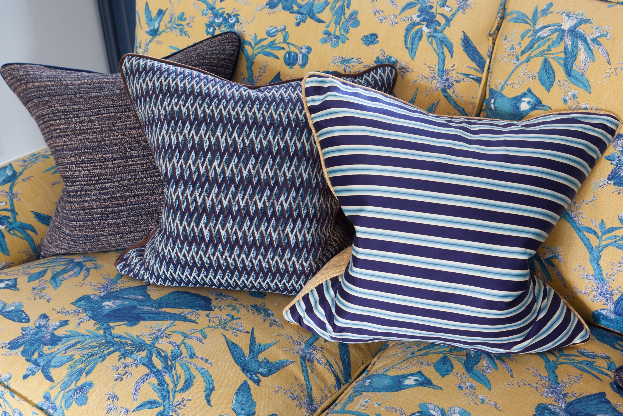
A balanced space often pulls from more than one family. For example, a structured stripe alongside a botanical print, layered with an abstract cushion – if unified by palette and proportion – can feel layered and sophisticated.
5. Group Patterns with Purpose
Once you’ve selected your patterns, placement is everything. Distribution determines whether the look feels cohesive or chaotic.
Start with a clear focal point. This is where your boldest pattern lives – perhaps on a rug, curtain, or feature wall. From there, incorporate smaller or more muted designs throughout the space to build harmony.
What brings everything together is often a unifying element – a recurring colour, shape, or motif. Even when patterns vary in style, this shared feature creates continuity.
Also, don’t underestimate the power of negative space. Areas of solid colour – on walls, upholstery, or accessories – give the eye a place to rest. They allow your patterns to breathe, and in doing so, make the patterns you do use feel more intentional and considered.
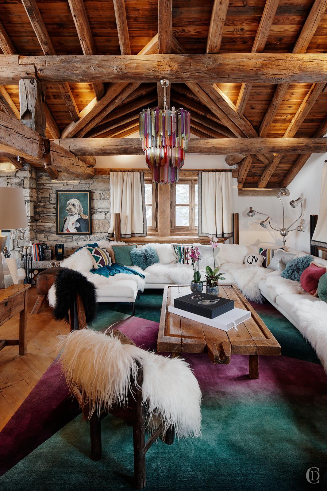
Over the years, I’ve learned that mixing patterns is part science, part instinct. There are guidelines, certainly – but they’re there to support your eye, not to replace it. Some of my favourite interiors didn’t come from rigid planning, but from listening to the space, experimenting, and allowing a little personality to shine through. This chalet living room cozy corner bursts with personality and is an example of restrained extravaganza : the colours of the rainbow illuminate in the vintage murano chandelier and the ombre effect rug was designed in bespoke shades of the clients favourite colors popping up on a few cushions but the rest of scheme is kept white offset against the dark wood.
At the end of the day, your home should feel layered, lived-in, and uniquely yours. Patterns – when thoughtfully chosen – are one of the most powerful tools we have to achieve that.
Stay inspired, stay sophisticated


