A Place called Home
Interior styling | Fulham

A team effort
Our clients are busy professionals with two primary school age children with sophisticated taste and a savvy approach to undertaking their first serious property development project. This energetic couple had very clear ideas of their own taste, requirements and a very good hand in assembling an A star team of specialists – their architect, main contractor, project manager, kitchen designer and the interior designers. When we came onboard the house was underpinned, the entire lower ground floor had just been opened up to create one enormous front to back open plan space and the house above was propped up. A visionary transformation was taking shape.


INTERIOR STYLING
Big picture advice
When we started advising the clients the building works were under way, the structural and spatial design was signed off and they had already undertaken their own research on finishes and short listed options for the hard materials such as tiles, flooring, marble and joinery veneers. We met at their prior home to review existing pieces of furniture that were destined to be reused – a tasteful mix of contemporary and antiques which resonates with my personal furnishing taste. We were also given a concept presentation of images and inspirations as well as the architects drawings.
We hit the ground running
Our brief was simple – lend a hand and a trained eye with a compatible aesthetic in the selection process. The options presented were all beautiful. We guided the clients how to edit, filter and put it all together and how to use paint colours and fabrics, lighting and accessories and source missing pieces of furniture. We shared a very collaborative journey of sharing tips and tricks how to finish off interior spaces.
Sizing it up
One initial question we worked through was which material and which pattern to use in the main entrance hallway.
To make this decision it is important to consider several factors. The colour scheme plays an obvious role as well as scale, proportion and style.
As with many Victorian houses of this period, new owners will execute modern conversions which invariably have to achieve a marriage of styles – in this case a contemporary extension and open plan lower ground floor accessed via a new minimalist metal staircase, joined with the ground and upper floor and its existing Victorian features ; skirting, cornicing, banister, dado and architraves.
We needed to strike a balance with the choice of material laid on the ground floor entrance. It’s the first thing you see and it has to fit in with the whole house. The particular choice we were given was between a small scale, intricate Victorian replica tile or a larger simplified retro styled pattern in a terrazzo finish. We mocked up the space – a narrow long hallway – with both patterns and presented this along with research on similar sized hallways with comparable designs of both options. The clear choice was to go with the larger simpler pattern which can be seen installed in this image.

INTERIOR DESIGN
A labyrinth of decisions
Gutting, rebuilding and furnishing an entire house involves such a multitude of small and large decisions and everything is interrelated; from paint colours, existing and new furniture, the shape and style of lighting, hard and soft finishes, carpets, selection of door handles, switches and sockets and any other decorative accessories. It can be overwhelming and we help clients by keeping a grip on the entire picture. We assess every choice in relation to the brief we have agreed and the desired aesthetic. In this project reviewed a variety of existing objects including curtains and furniture which all had to be visualised together with the new items to be purchased. Our team excels at this kind of osmosis of blending old with new and curating and refining how to add selective pieces so the entire scheme looks organically developed and natural.
The red thread
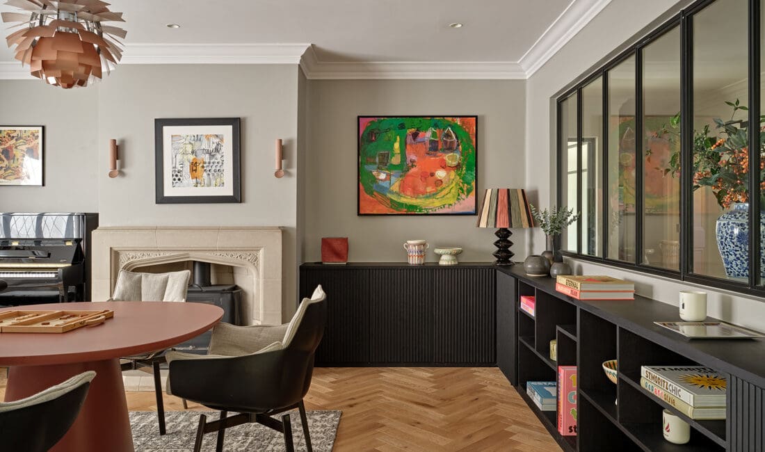
We always look for a spark, a guiding light in a new scheme which can then be woven through the entire house in different guises and paired with other colours and materials. In this case the clients had picked a traditional Austrian ‘Kachelofen’ which would sit in the kitchen on the newly opened lower ground floor. Functioning as a true heater and offering a connection to the client’s roots, memories of home and providing a blend of old and new in the contemporary extension it became our red thread. The deep turquoise shades of the hand made clay tiles was woven in small doses through other spaces. Shades of blue were now paired with shades of orange, nutmeg, tanned leather and deep purple and dashes of grey and black and this became the theme like a chorus in the background to the song of the house. The next step was to select all the wall paint colours for all rooms and marry them up with the tiles and existing pieces to be used then we sourced the additional fabrics and wallpaper and furnishings.

Hidden gem
The house came with existing pairs of curtains several of which were of very good quality in neutral shades which we incorporated into our palette of teal, turquoise, cognac and grey.
In our studio we carry a vast library of fabric swatches as we always collect a multiple more of samples during any project than we end up using. Stocking a decade worth of swatches has the advantage that occasionally you find a hitherto not used gem which suits a new project.
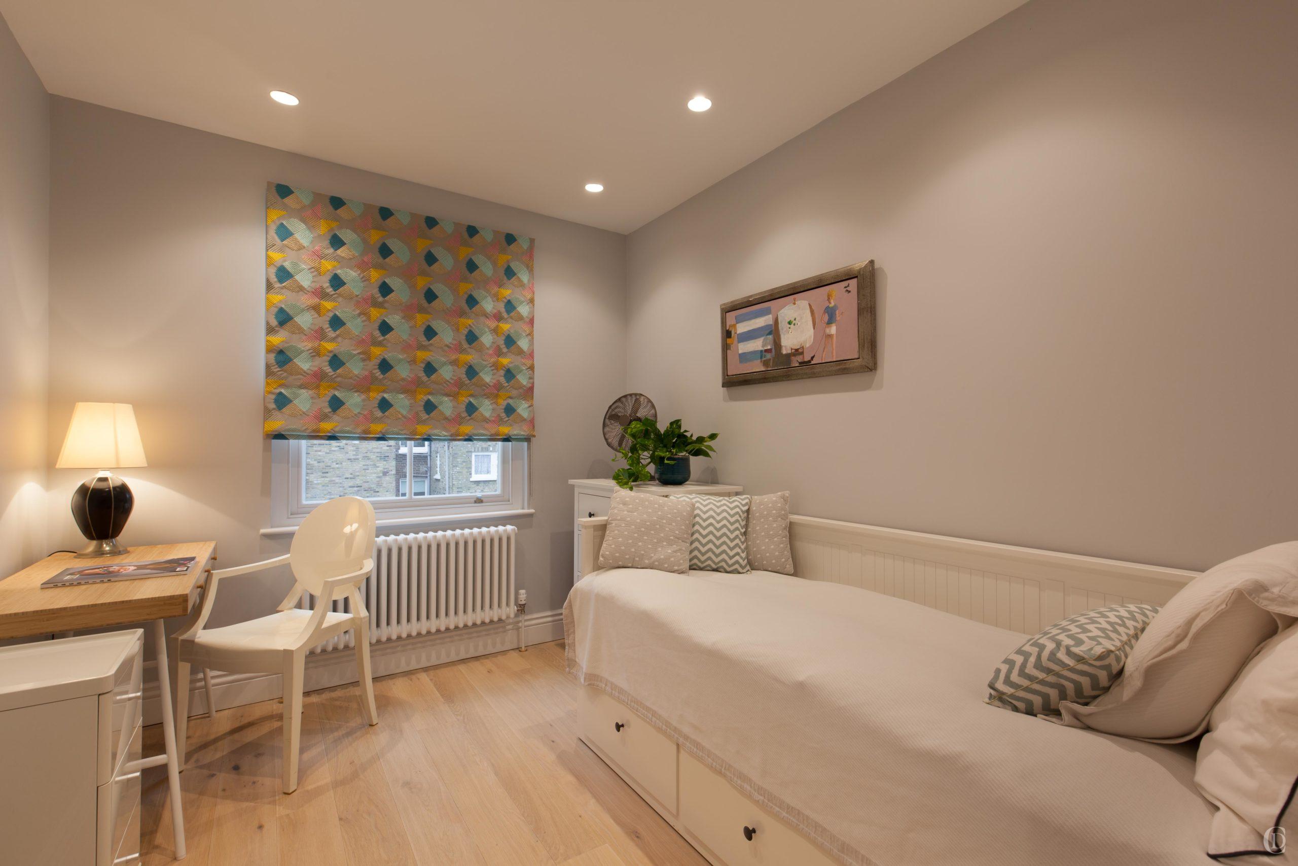
The fabric for the roman blind in the master bedroom was such a gem and we all fell in love with this fabric and from there the rest of the bedroom scheme was developed, blending paint, furniture, bedthrow, art, cushions, lamps.
A beautiful feature is the teal seagrass wallpaper which we applied to the new wardrobe doors.


Changing places
Colours and styles continued to be woven through the house. Turn of the century Austrian antiques and mid century vintage blended with contemporary furniture, terrazzo tiles with varying splashes of colour matched with vibrant paint and contemporary structural improvements throughout the property. In any home styling project as we work closely with our clients, we invariably become involved in conversations about room layouts, furniture positioning and hanging art.
This study used to be an afterthought, a bit of a dumping ground as it happens in many homes. Shifting the desk to the window, hanging the artworks and tidying up shelving we managed to create enough space to order a small mustard coloured pullout sofa which will offer an extra space for overnight guests.


